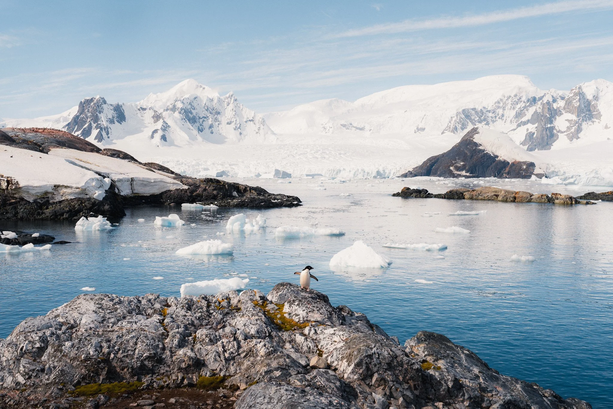
My Secret to soft and colourful photos
In this blog I will answer a commonly asked question about my photos. How do I get such soft and colourful images? Of course, not all of my work has that character, with a large percentage of it not being so colourful. However I’d like to believe that all my work has a nice softness to it, which I can assure you does not involve any external filters.
Light
Before getting into the weeds, I need to get some basics out of the way, and I apologise in advance if I sound like a broken record here. Shooting in the right light will do 90% of the work for you. If you head out on a sunny July day at lunchtime, you will have to deal with extremely harsh light. If you shoot with the light source behind you, then you will have to deal with a lot of harsh detail and a flat look. While you can use some techniques I will cover soon to make these images appear softer, you will just have a tougher time compared to picking good light and a better lighting technique.
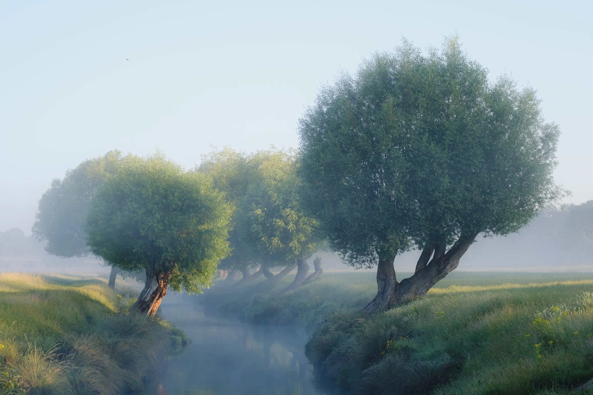
In short, you want to shoot at times when the light is a little softer. Since we are soon heading into summer, for me it would be anytime from around 07:00 until about 11:00. I would then have a break and shoot again from around 14:00 until about an hour before sunset. I tend to avoid golden hour as it’s not my cup of tea, hence I don’t mention it. Shooting in the mornings also tends to result in softer images due to any haze that might have formed.
This was around 10am - soft light
This was 1pm - harsh light
In terms of positioning, whatever lighting condition I am shooting in, I always want to ensure the source of light is coming anywhere within a 180 degree radius in front of me. This creates the most dynamic lighting and adds natural contrast.
Light coming from the back

Light coming from the side
Composition
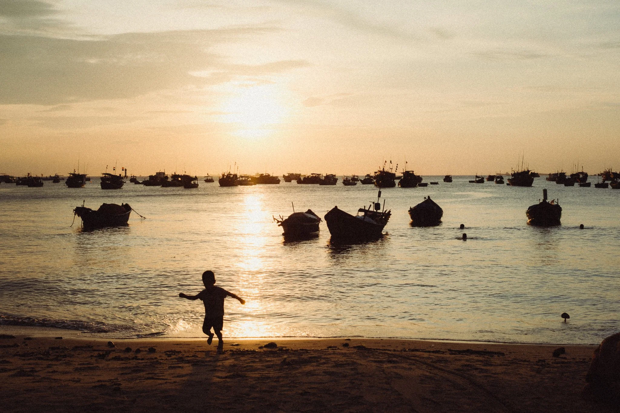
This isn’t a blog about composition, so I will keep it on topic. You want to ensure your photos are as minimal as possible and avoid unnecessary details. While this has zero impact on actual softness and colour, it can give the appearance of a softer image when there’s less clutter and information. This is the most ambiguous and subjective part of this blog, so feel free to ignore it. However in my experience, the simpler the photo, the better it looks.
Simple scene
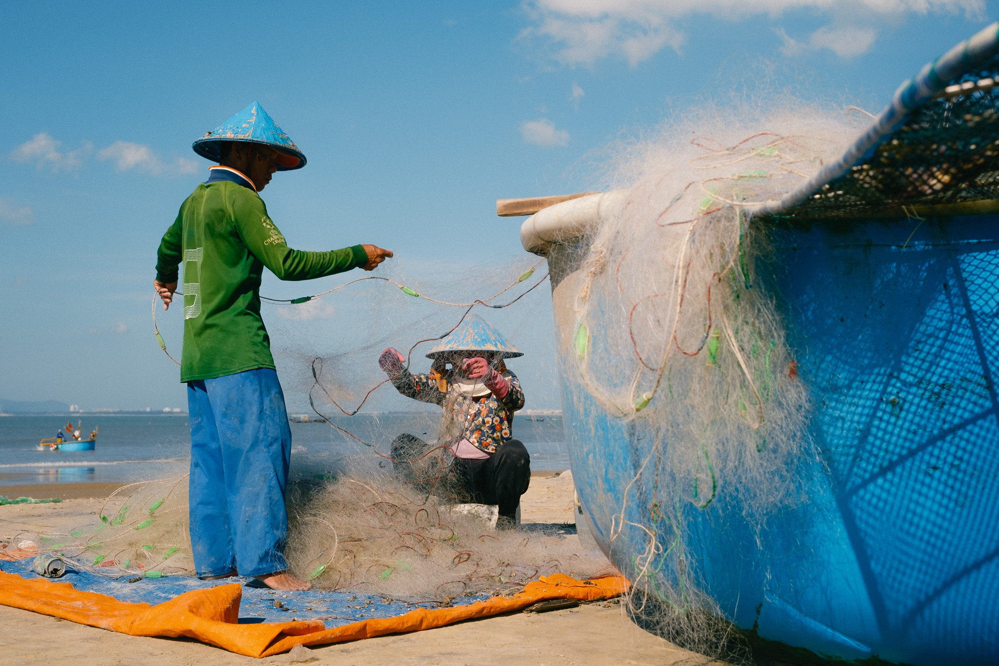
Chaotic scene
Aperture
If I am going for soft images, I will try to shoot at wider aperture values. If the lens is an f2, then I will try to stay below f2.8. Typically lenses are at their sharpest anywhere between f5.6 and f11. When shooting at or close to the maximum aperture, lens performance softens up, thus resulting in softer images.
Exposure & WB
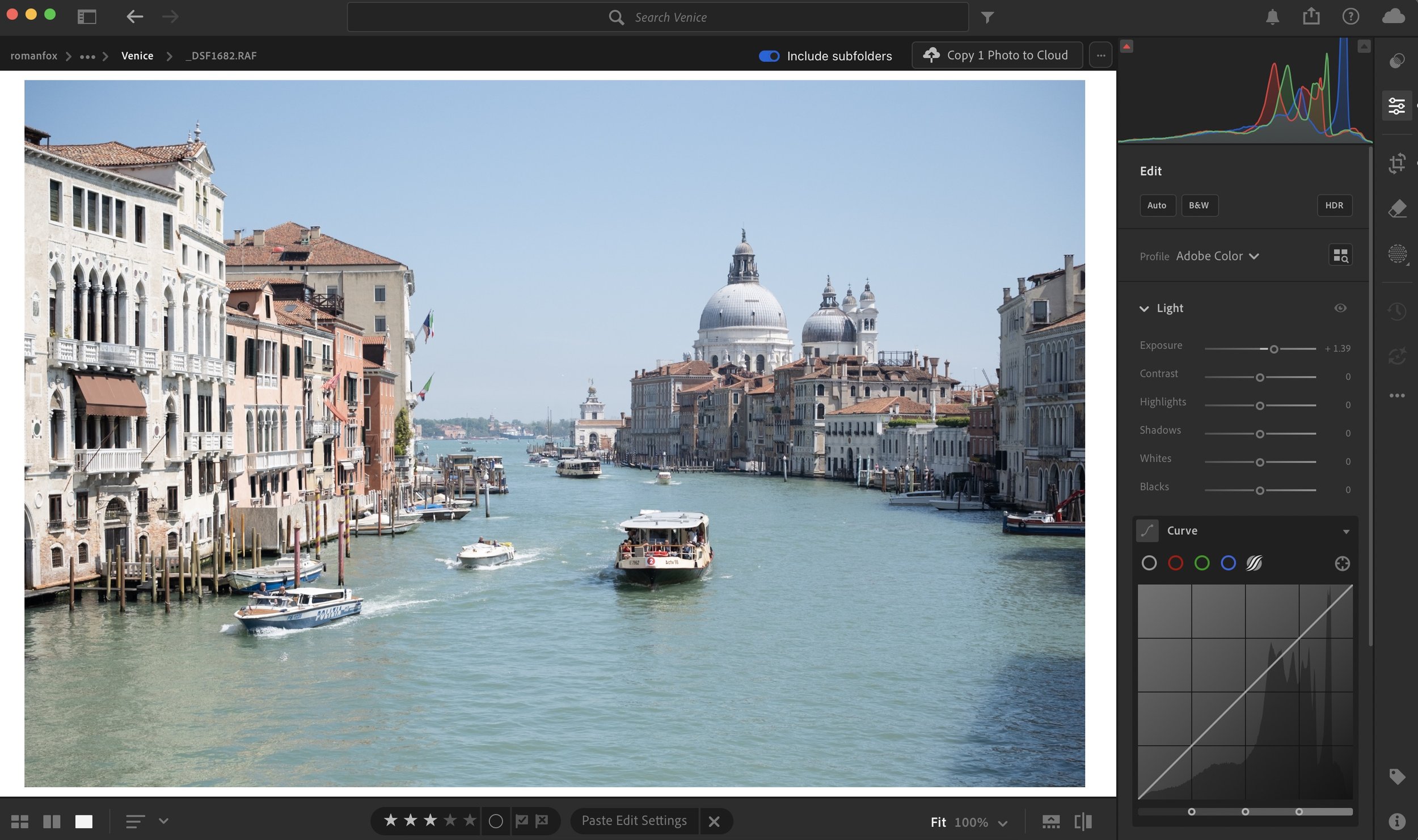
Now we can dive into the editing part of this blog. I’m assuming you’re shooting in RAW with your exposure and white balance being set to auto, thus making them roughly right. These two adjustments are probably the biggest levers you have when it comes to setting a strong baseline to edit from. While you might have technically correct settings, they might not necessarily reflect reality and how you felt being there. For example, on a harsh sunny day, the RAW file can appear underexposed and unnaturally cool.
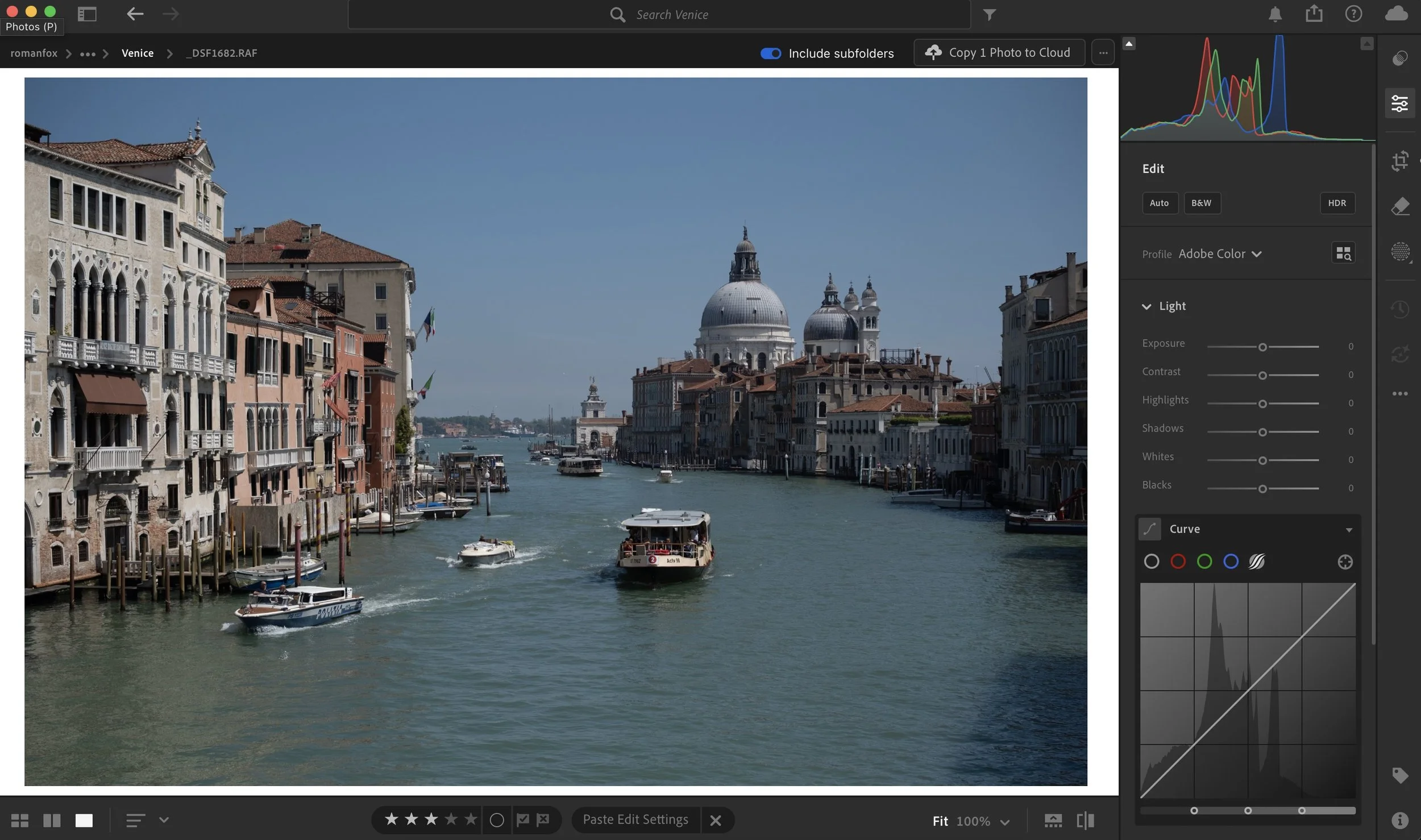
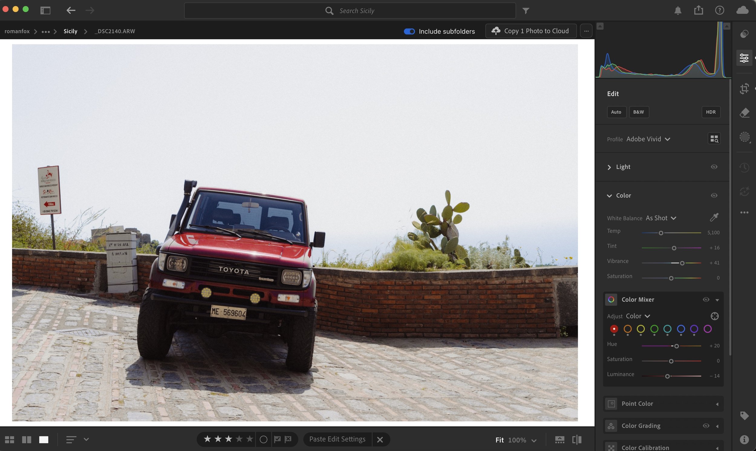
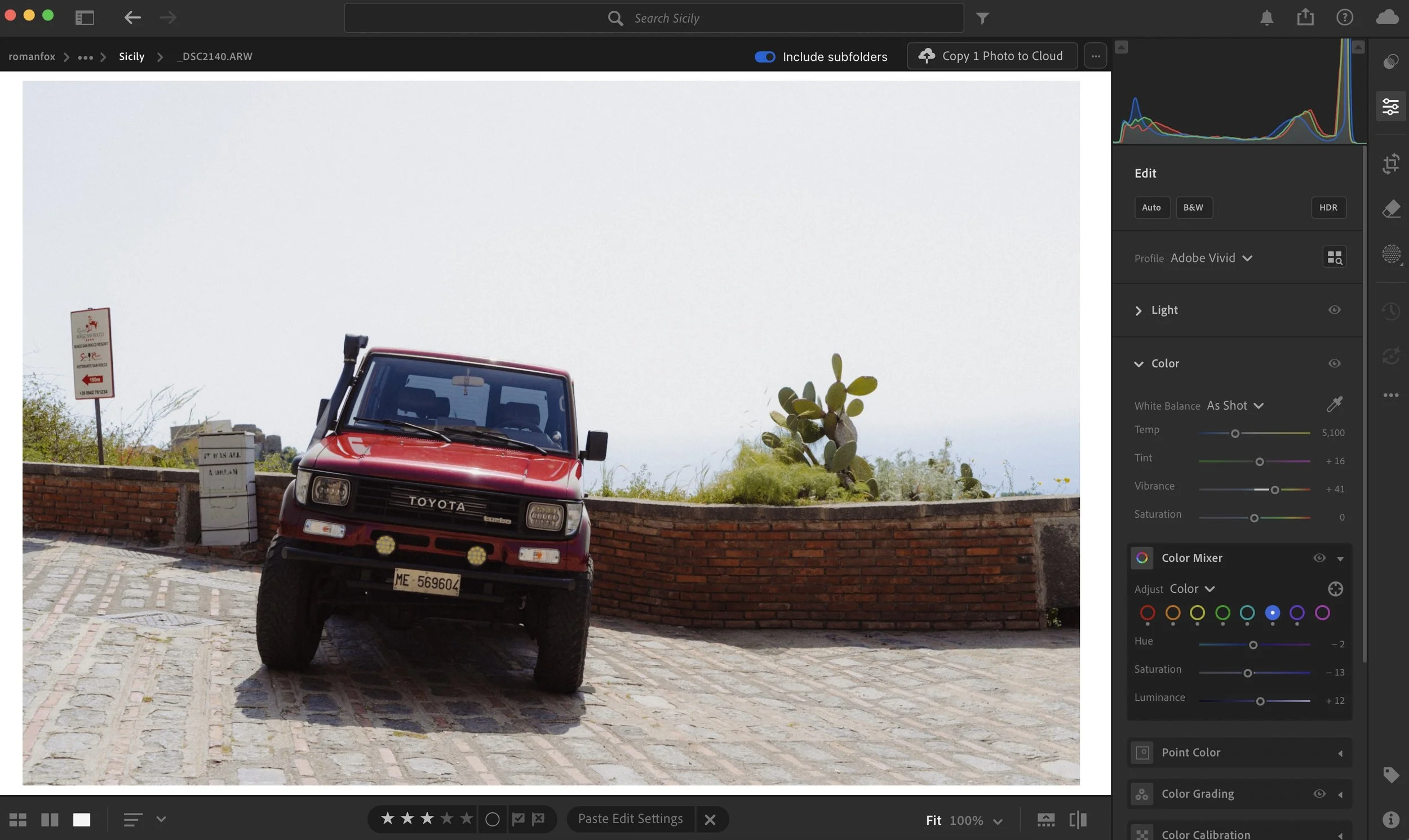
As shot
Fix exposure
The first thing I do is fix these issues and bring them closer to how I felt being there, not what is technically correct. I like bright warm images, so in most cases I increase the warmth and exposure.
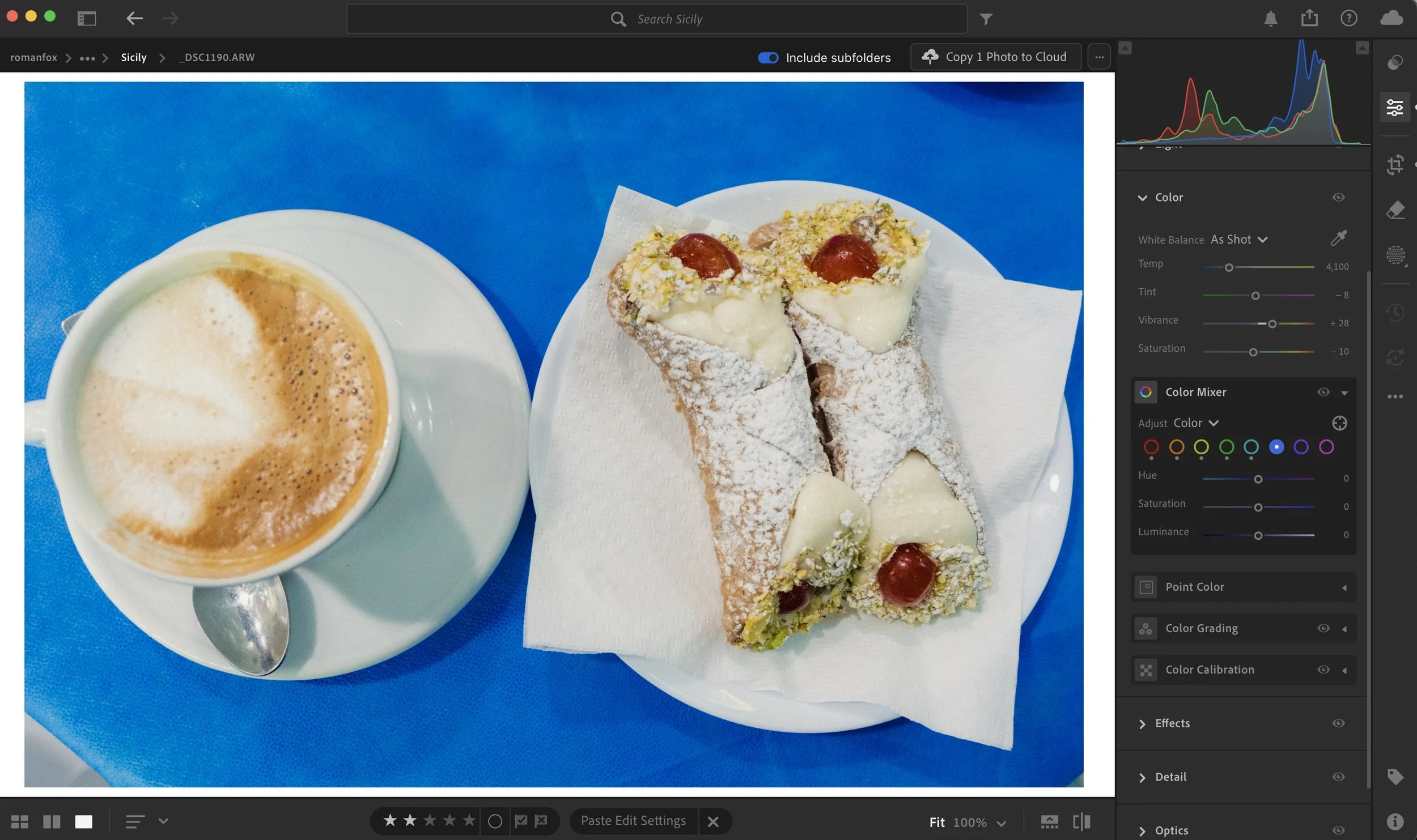
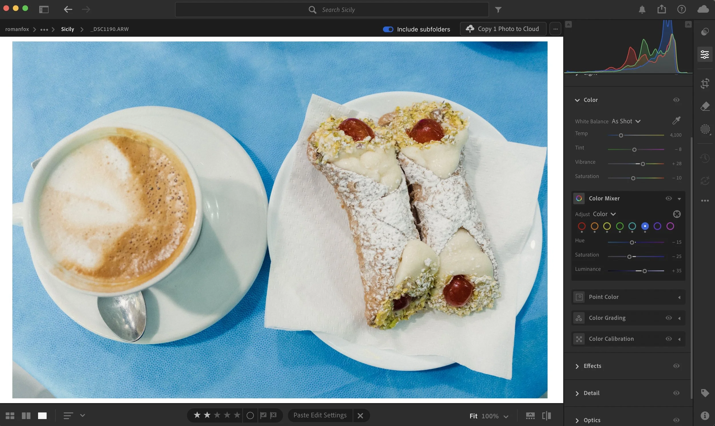
Original white balance
Closer to how it felt
Sharpness & Clarity
We will start with the most obvious adjustments that make a huge difference. When it comes to sharpness, I always leave it on the default setting except the masking adjustment. Masking allows you to target any sharpening only to the areas that actually have detail to sharpen. I set mine to 90 as I only want it applied to the extreme edges of any detail. In Lightroom you can visualise this by holding the Alt key on your laptop and moving the slider. On iPad you can touch and hold the screen while adjusting the slider to get the same visualisation.
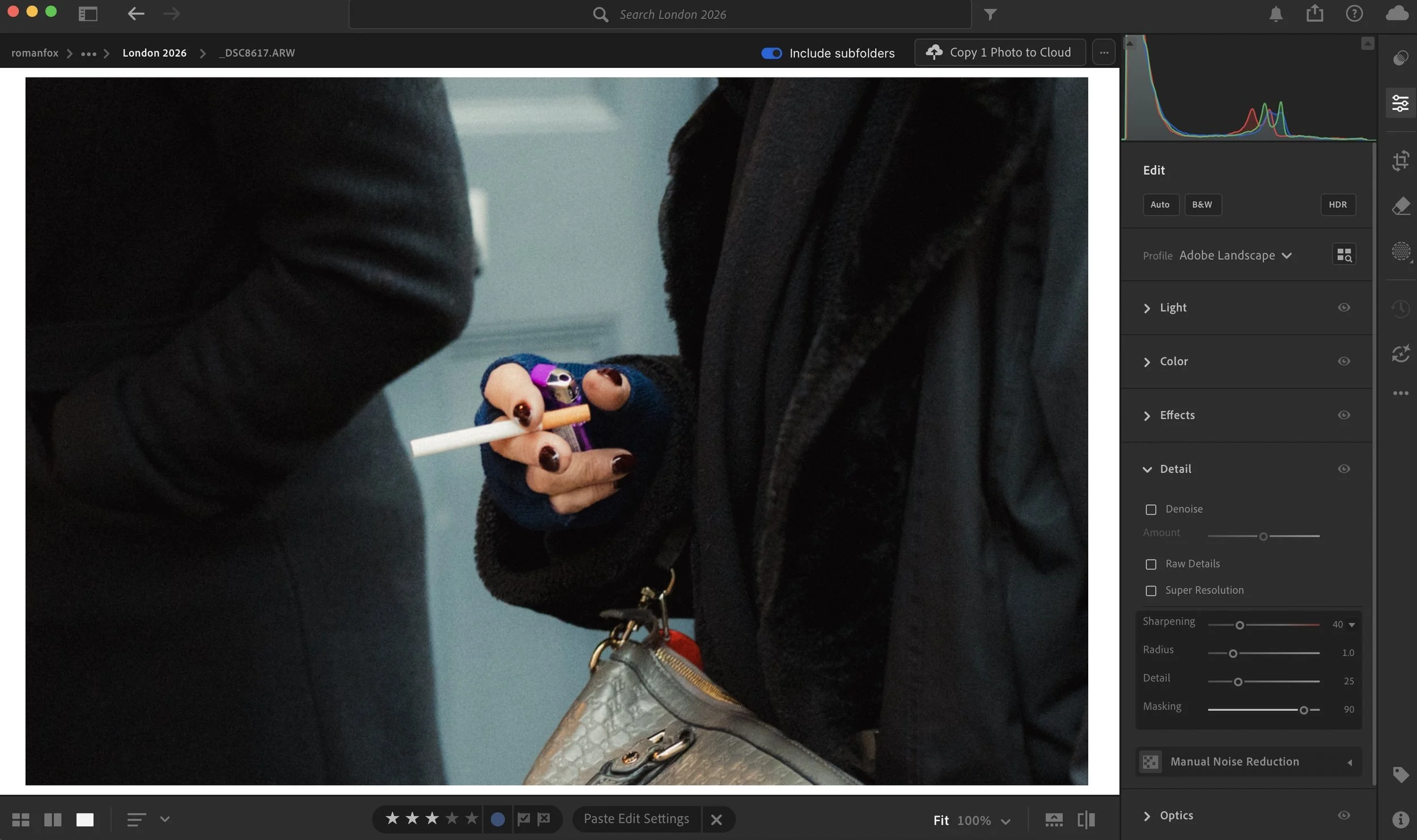
Clarity I almost always reduce to -20 as a starting point. On some images -30 works best, while on others -10 is all that’s needed. This does a lot of the heavy lifting in creating a softer look, but take care not to overdo it. It can go from tasteful to weird very quickly.
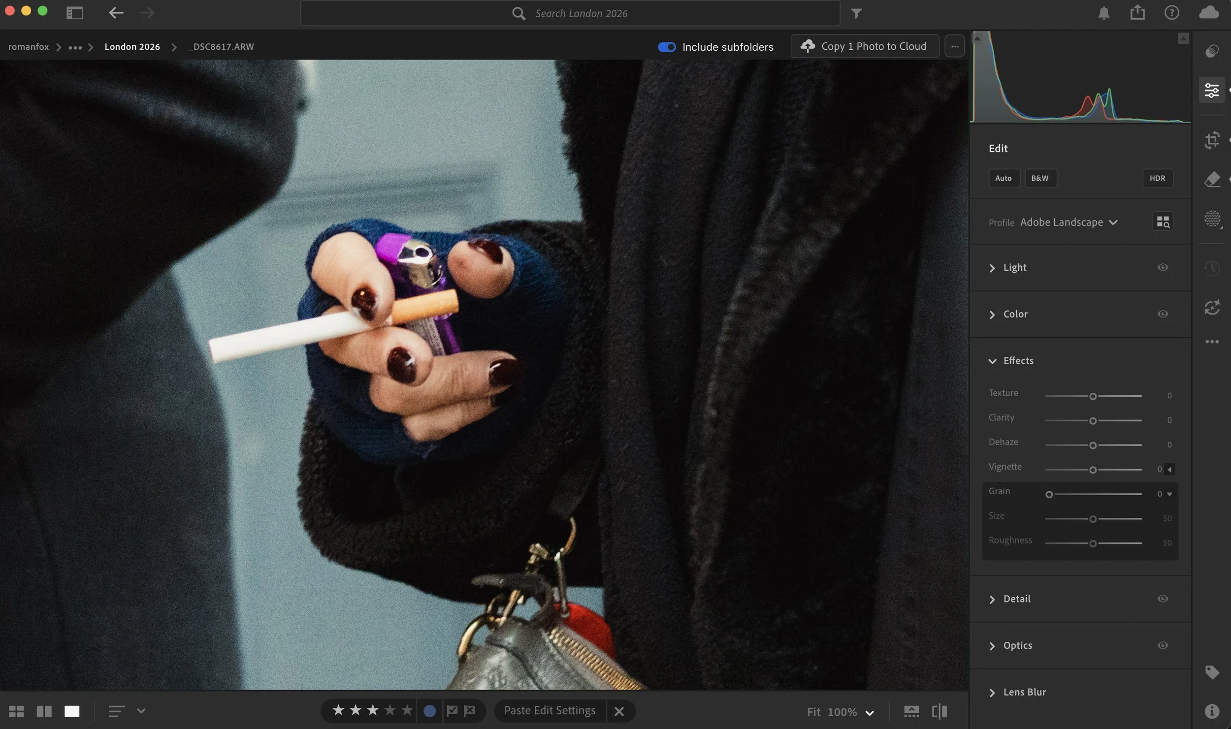
No adjustments
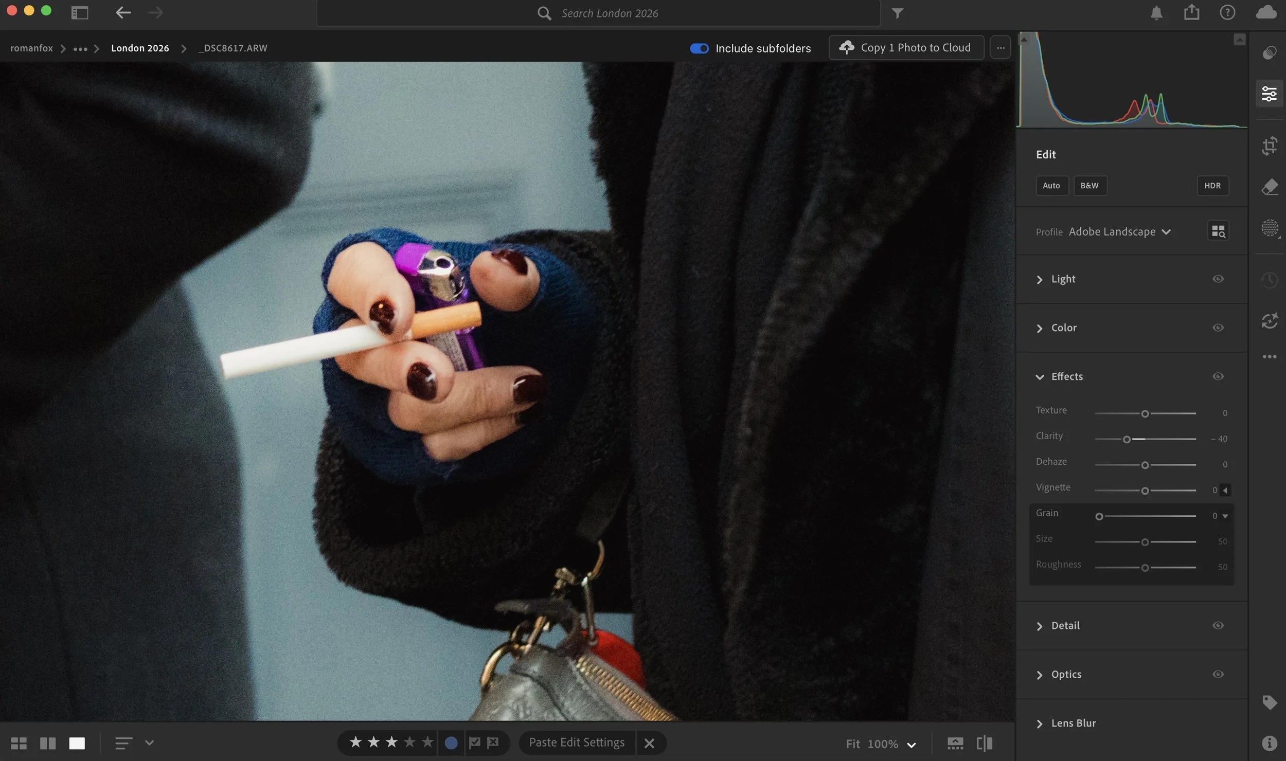
Negative clarity
If you have some detail that you need preserved, then use selective adjustments such as a brush to gradually add clarity or texture back into any area that needs it. In Lightroom I like to add texture back in as it tends to preserve the softness.

Use brush for selective adjustments

Add texture selectively
Grain
Adding a bit of grain can give your image texture and make it feel less digital. Naturally grain also softens the image by making the details appear a little more fuzzy.
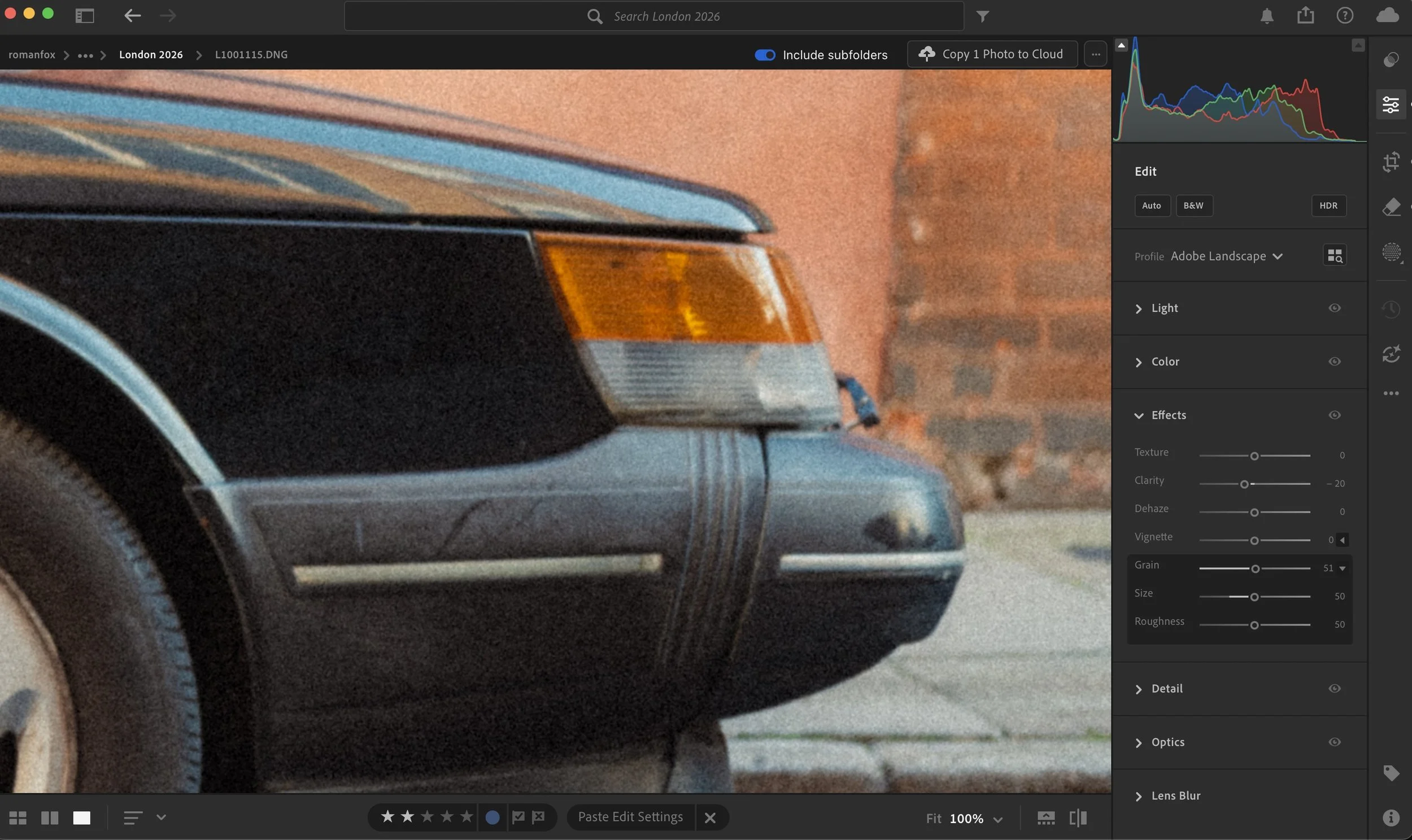
Some grain
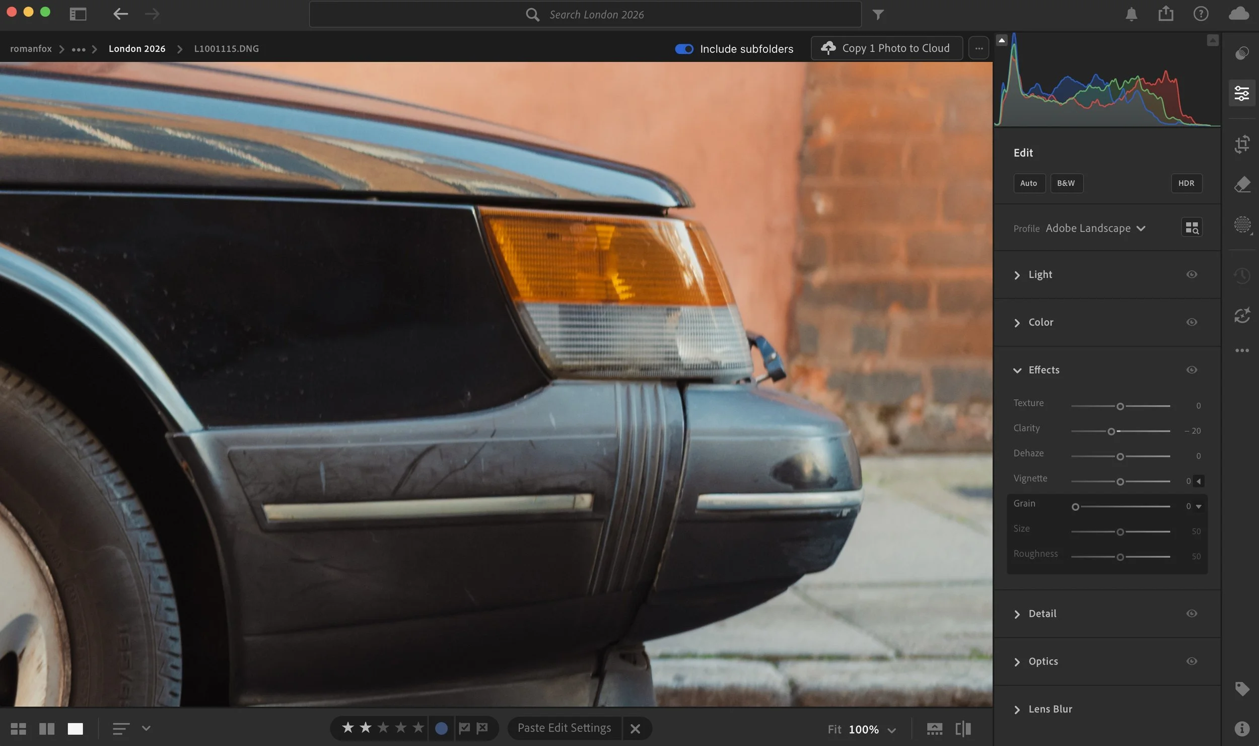
No grain
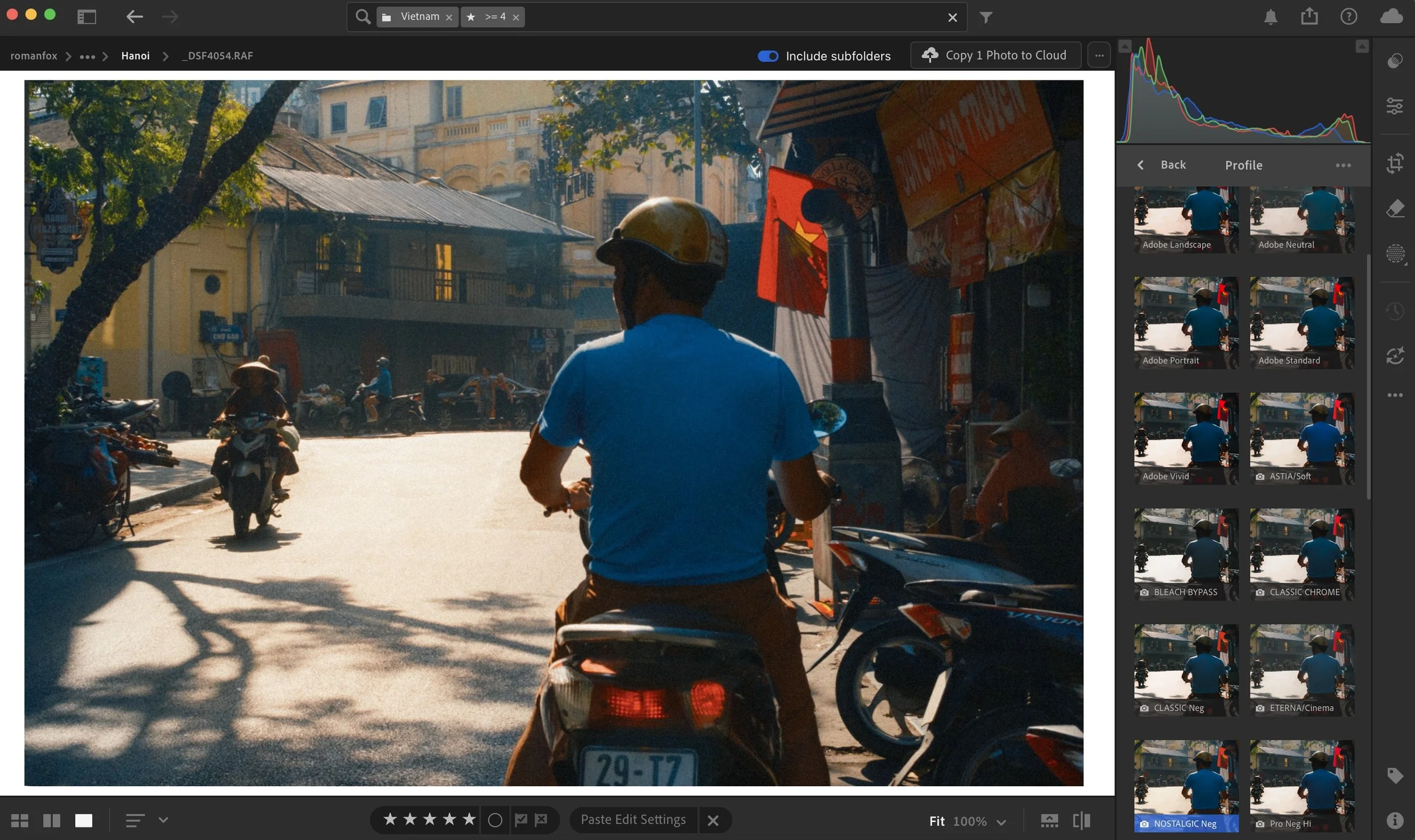
Profile
Lightroom and most decent apps now have a profiles tab where you can change the starting point of the image. If you shoot with Fuji cameras, this is where you can set a specific film simulation as a starting point. Even if you use Adobe’s default profiles, you have some choice on which look to start with. Neutral will give you a very dull and desaturated look, while Landscape will give you a soft and saturated appearance.
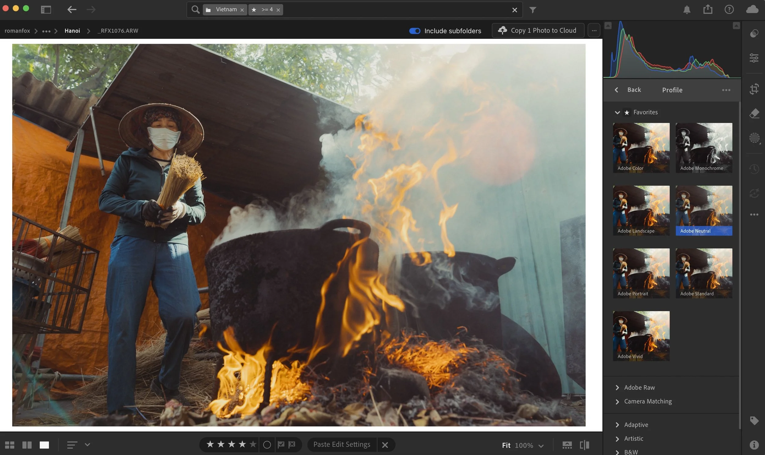
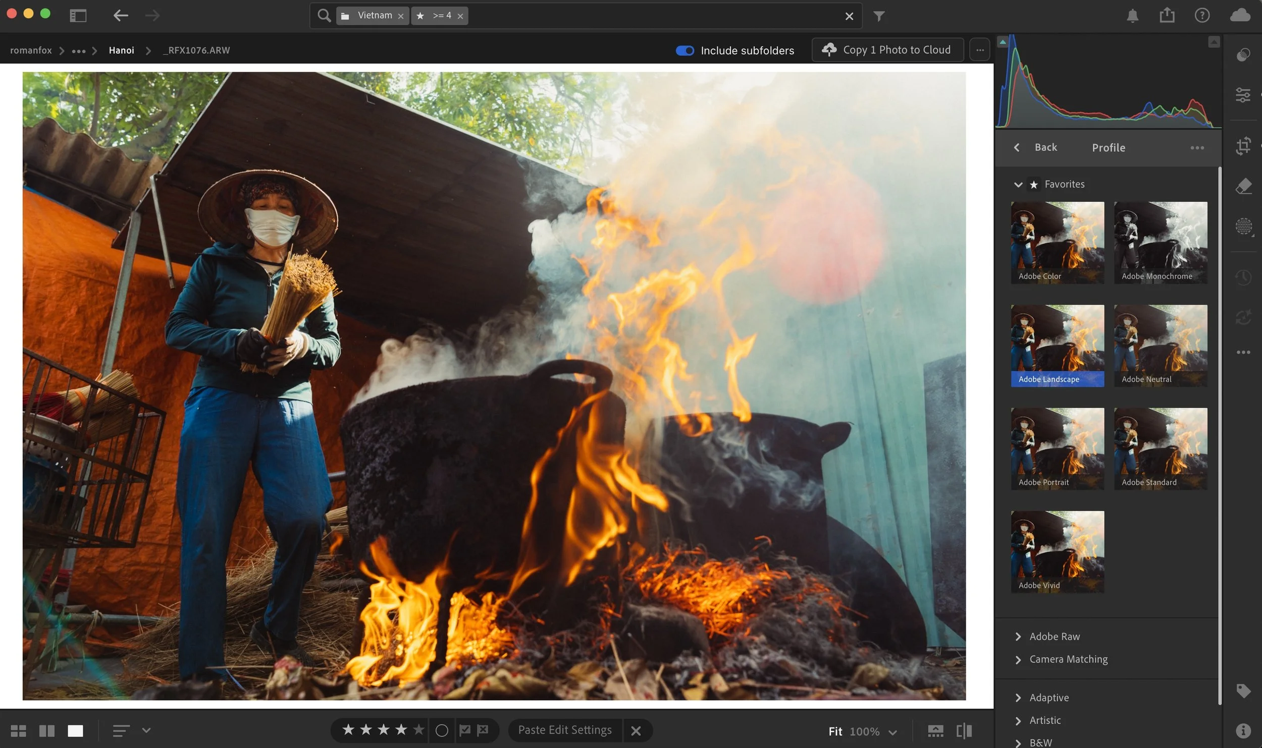
I tend to use the Landscape profile a lot, however if it’s too much, then Adobe Portrait is my next choice. If I’m editing a Fuji file, then Astia or Nostalgic Neg are my go to profiles.
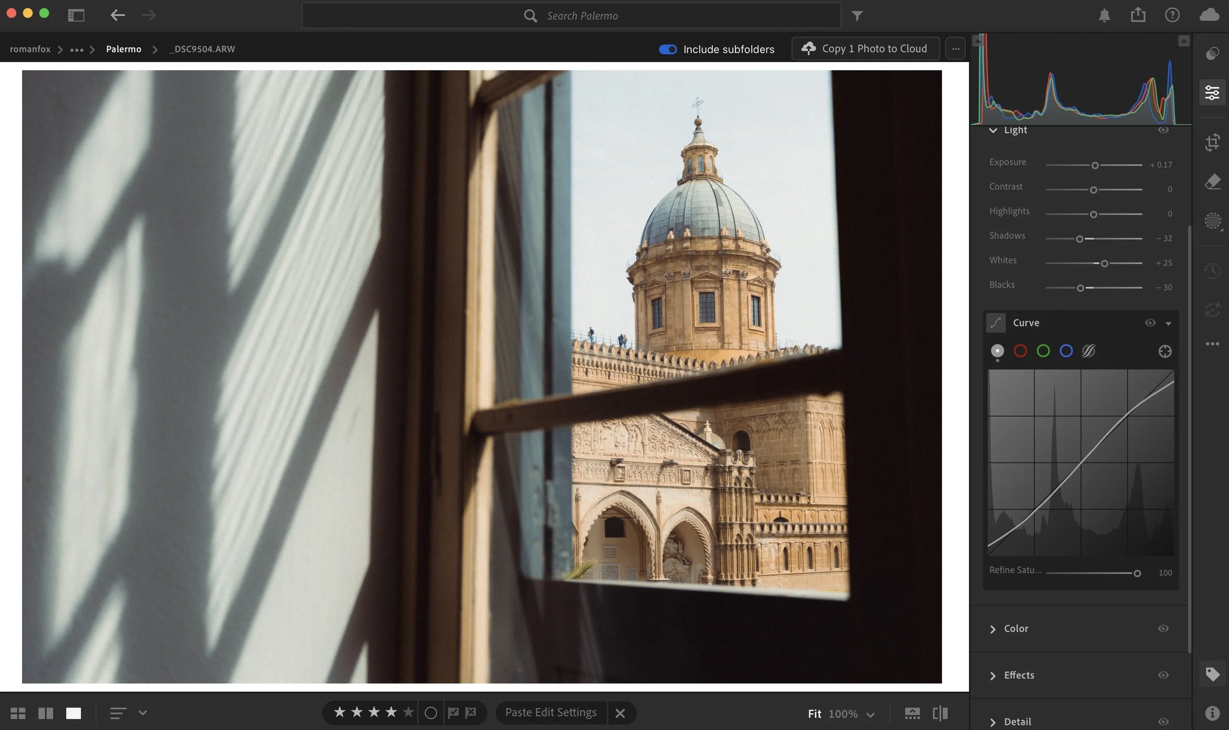
Tone Curve
Tone curve can be used to exclusively edit and colour grade a photo, as it’s one of the most complete editing tools out there. However for the purpose of this blog, we will only use it to add some softness into the image.

The first thing I do is slightly increase the black point. This will add a little fade into the blacks and make pure black a little more grey. I would then do the same for highlights, with the goal of making pure white appear off-white.
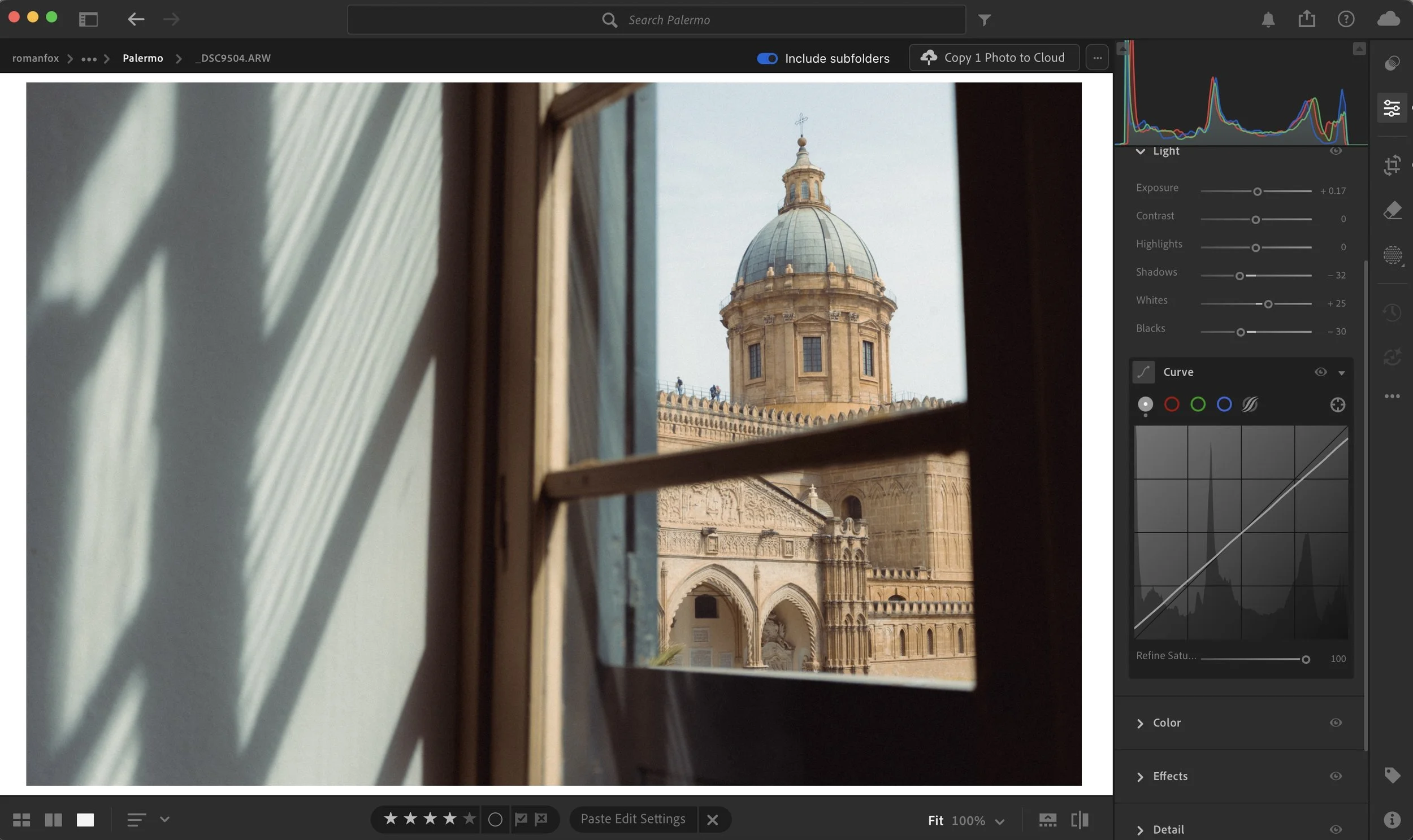
If the image feels a little flat, you can add a subtle S curve to bring it back. This curve helps remove harsh black and white parts of the image.
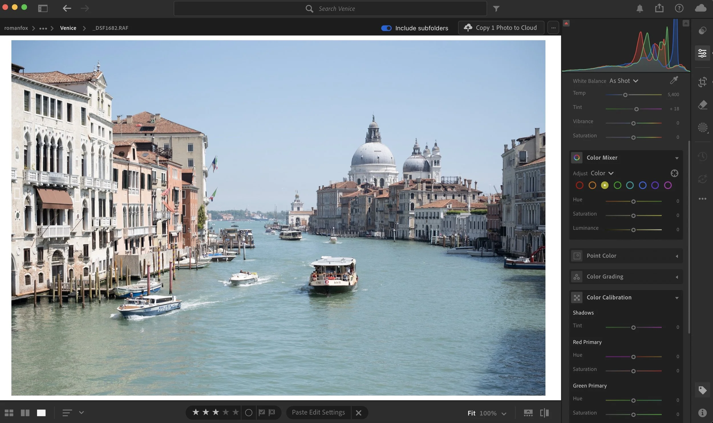
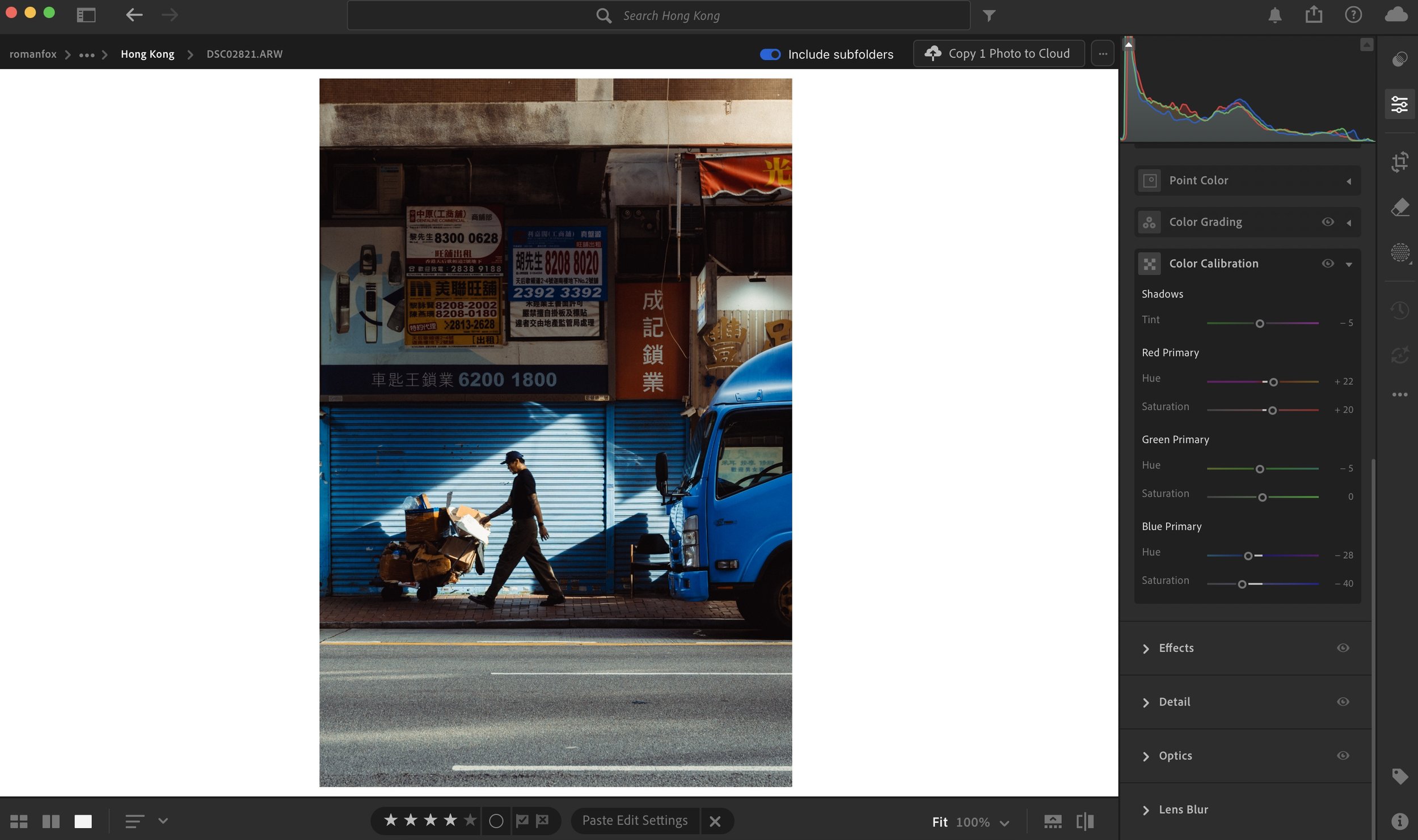
Calibration
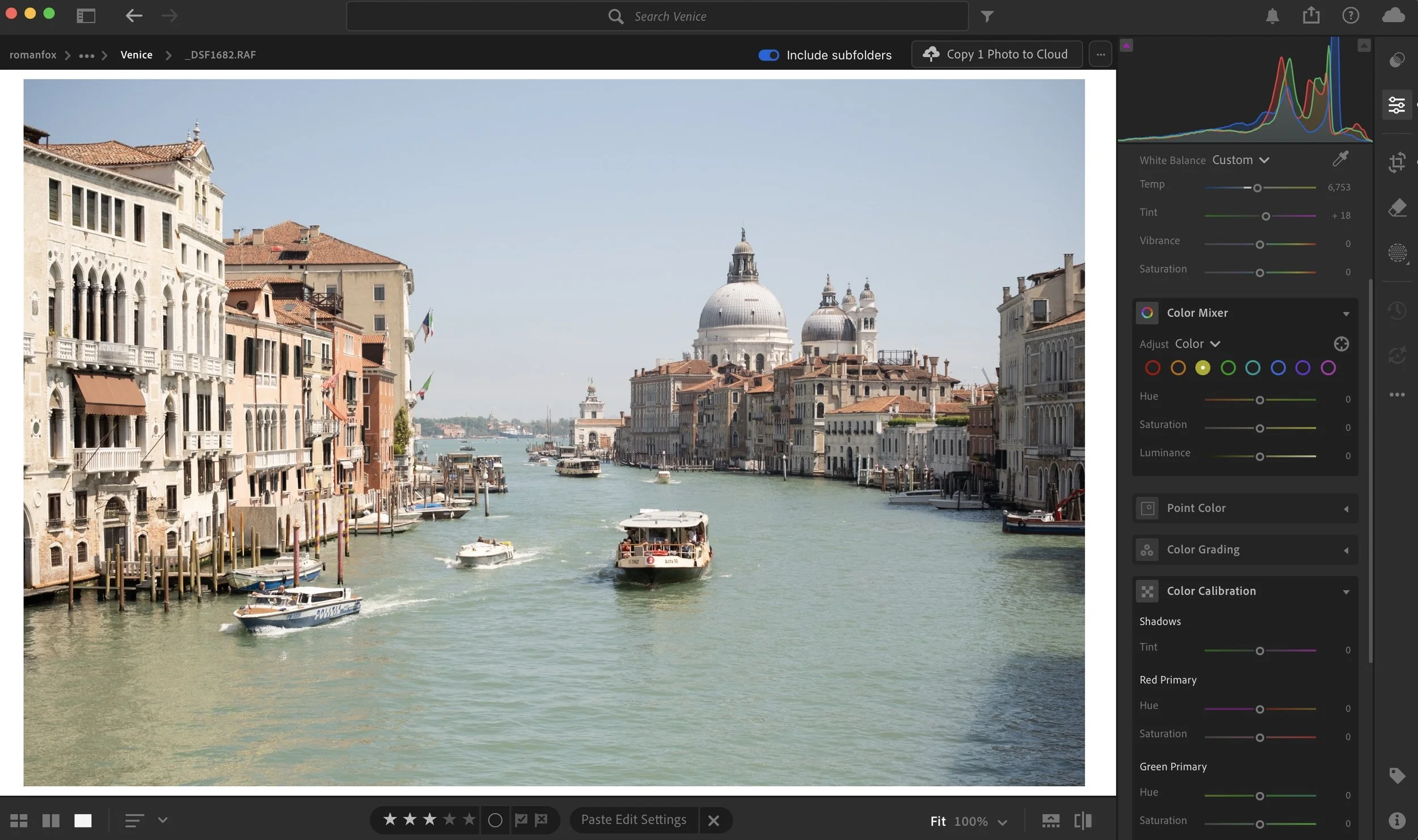
If you’re a Lightroom desktop user, this will apply to you. If not, then feel free to ignore it. The Colour Calibration tab in Lightroom is pretty unique in how it impacts colour. Effectively you’re changing the definition of what a colour is. The HSL tool that we will cover shortly will change how a certain colour appears. So it can take red and shift it to orange. The calibration tool changes the RGB components of a colour, thus changing how the entire image looks.


This is a pretty complex and niche topic, so I will save it for a dedicated blog in the future. For now I will share my typical adjustment that I apply to most of my photos below.
HSL
This is where the bulk of my colour work is done. This tool impacts the hue, saturation, and luminance of any colour you select. I typically boost saturation of warmer colours while reducing it in the cooler tones. I usually shift blues slightly towards teal, and reds slightly towards orange. Greens and yellows will depend on the scene.
As for luminance, I usually darken the warmer tones and brighten the cooler colours, however this also depends on the scene. These are generic guidelines I start with and a lot of adjustment is done depending on the image.
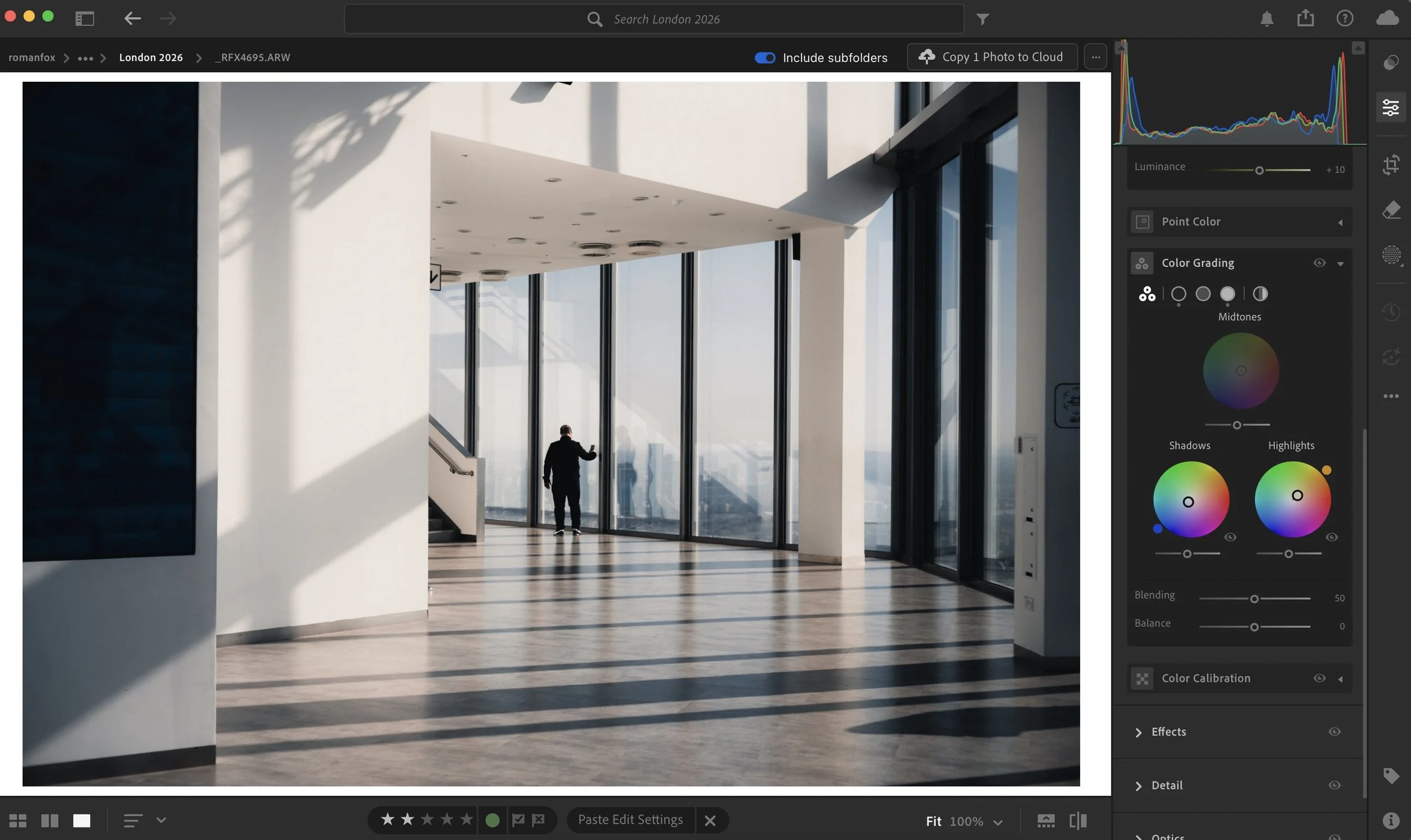
Colour Grading
Colour grading doesn’t change any of the colours in the photos, instead it injects colour into the image. There are two primary ways to do this. The quick and easy way is using the Colour Grading tab, while a more advanced and precise way is to use the curves. Having used both methods, I personally prefer the simple colour wheels.
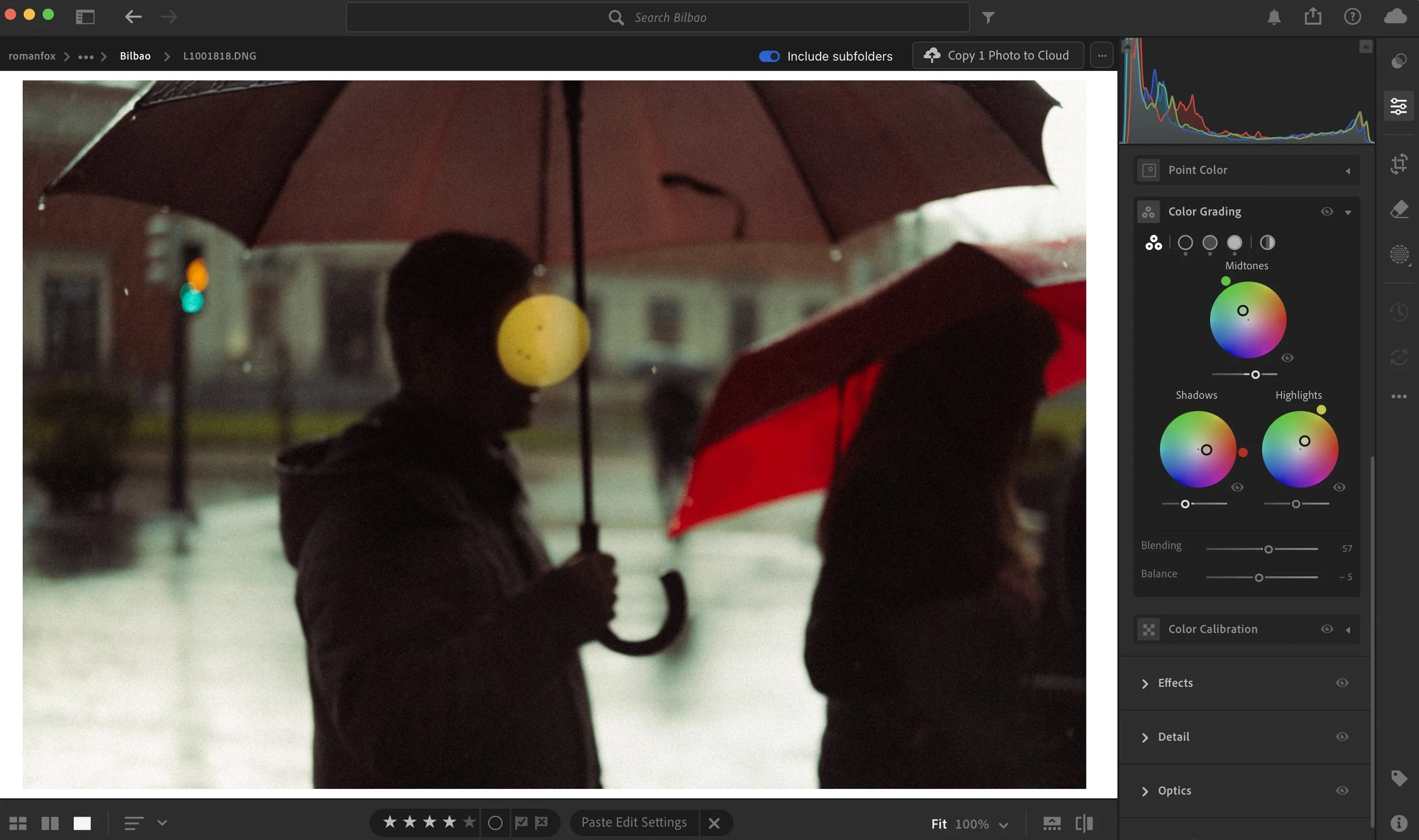
This can vary considerably depending on the image but in most cases I will have three distinct looks. Cool shadows and warm highlights. Red shadows and cool midtones. Green shadows and warm highlights.
My Little Photography Book
If you found this blog helpful and wish to learn more, may I suggest picking up a copy of My Little Photography Book. This contains everything I know about photography. With a one time purchase, you get free lifetime updates as new chapters are added.
My Little Photography Book is everything I know about photography in one concise place. This book is designed to save you time and share years’ worth of knowledge in an easy-to-follow format. Think of this as a workshop and a course in one affordable 300-page package.
This book covers psychology, gear, lighting, composition, storytelling, style, and a lot more. In other words, I’ve emptied my photography brain into this PDF. As always, keep in mind that this is simply my approach to photography, and everything I share is from my own experience.
The book is a digital PDF download and comes in two flavours. Two page spread and single page. The spread might be better for landscape viewing and printing, while the single page is more suited for vertical scrolling on a phone or tablet. The total download will be just over 100mb with each PDF being around 50mb.
This book has been in the making since mid-2017 and is by far my most involved project to date. This is also entirely done by myself from scratch. All the writing, editing, formatting, everything… it’s all me with no external input. I really do hope you like it, and as always, I welcome any feedback.
Please note that due to the nature of digital products, refunds are generally not accepted. However, if you experience any issues, feel free to contact me and I’ll review your situation individually. You are welcome to use this product for personal or commercial projects, but you may not copy, distribute, or resell the files in their original or modified form.
Finally, being a digital product means free updates when new chapters become available. The last update was in February 2025 to V2.
Thank you so much for your support
Much Love
Rome
Lightroom Presets
Everything I talk about can be seen in these Lightroom presets. They are a result of years of editing and experimentation. While I don’t encourage you to rely on them for your photography, instead opting to develop your own style, I would recommend them to learn my editing approach and as a starting point.
Instead of telling you how these will change your life, I would rather be practical and answer the most common questions that people tend to have when buying presets.
What are presets?
They are editing settings that are saved in a file and can be applied to any image.
Why do people buy presets?
Sometimes because they like the work of the photographer and want that style for their own photos. Mostly because they would like to see how other people edit and learn by reverse engineering the presets. Other times it’s just to support their favourite photographers, thank you!
What’s the overall style of these presets?
- Filmic
- Minimal
- Soft
- Bright
What are these presets suitable for?
Street & Travel Photography
Some Nature (with further editing)
Some Portraits (with extensive editing)
What do these presets look like?
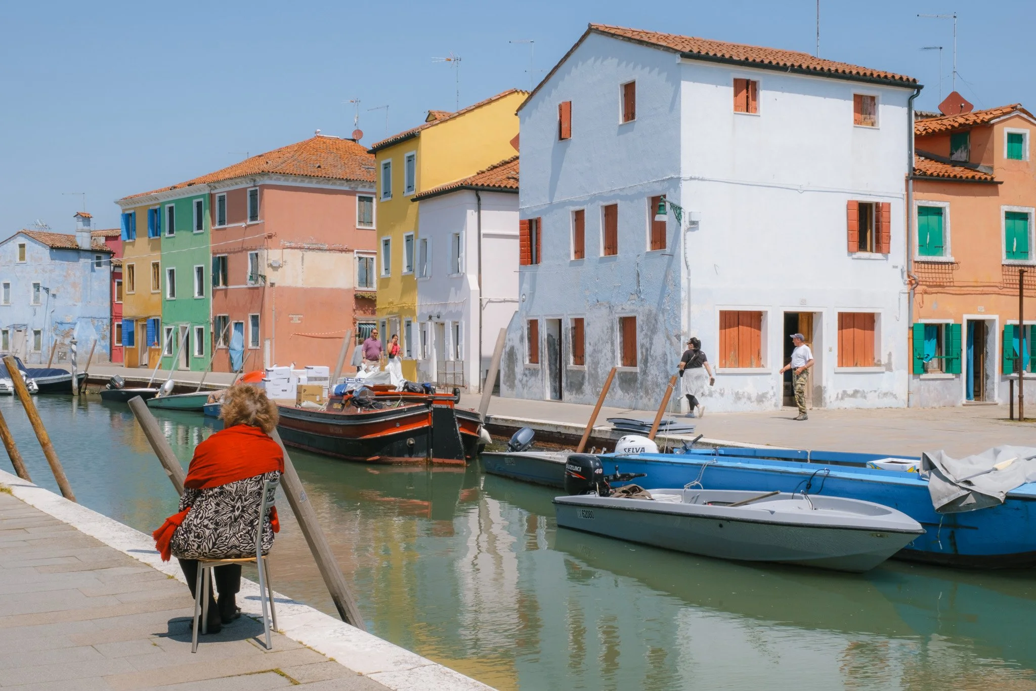
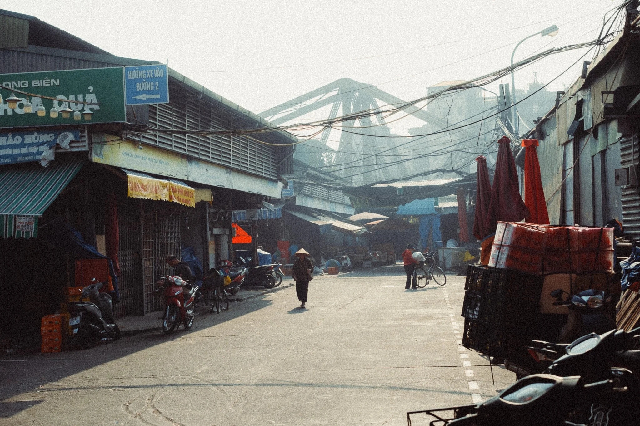
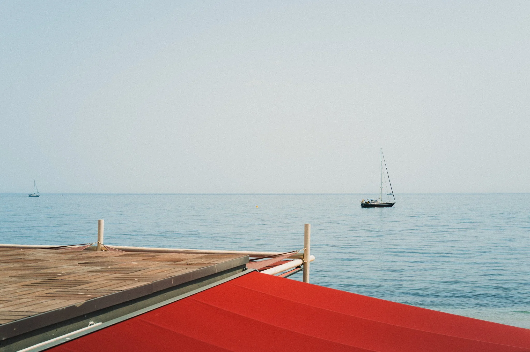
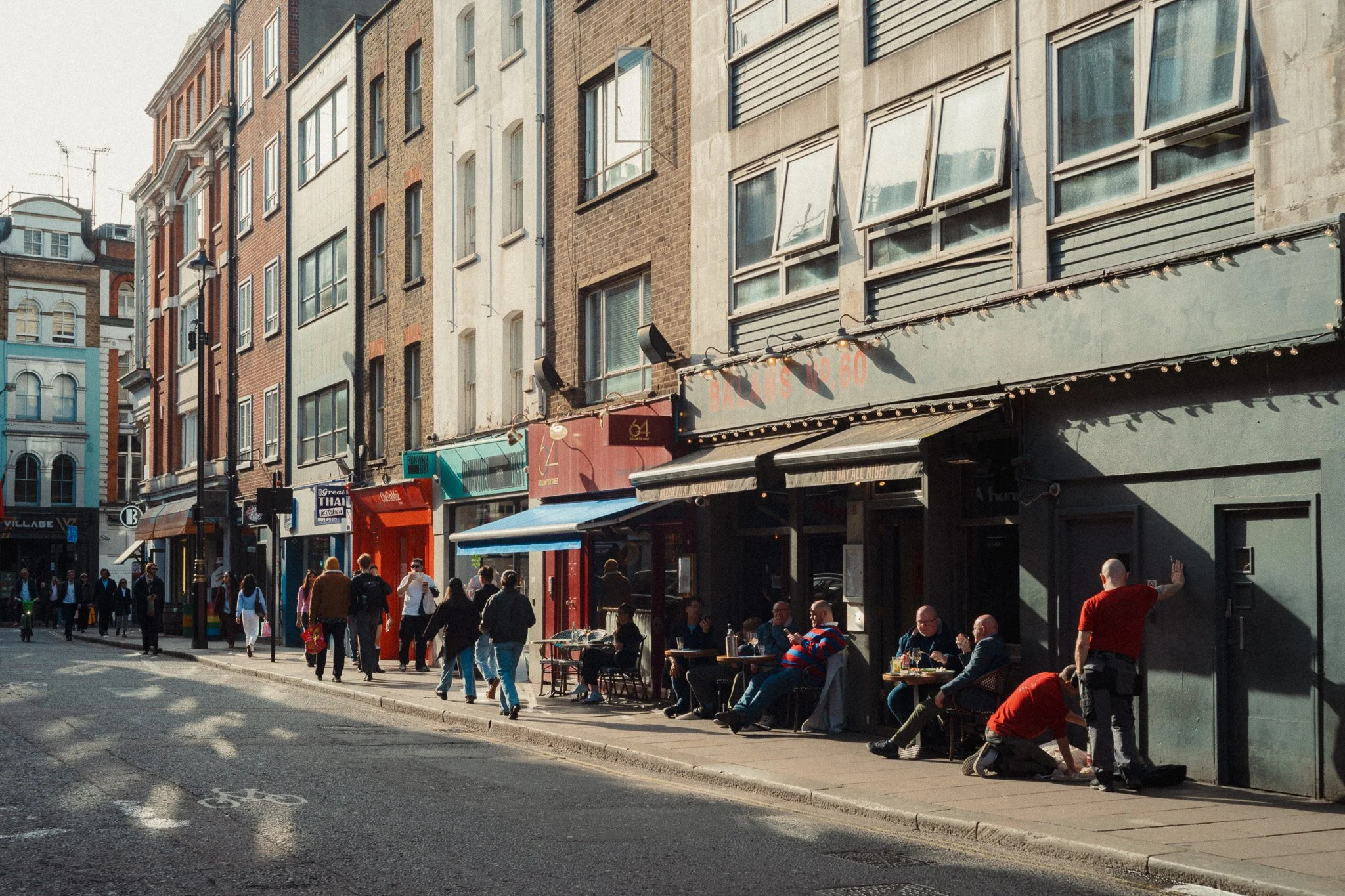
These presets 100% reflect my current editing style. Please see examples of work below.
Do these presets get updated?
Yes, as my style changes, these presets will also be updated. Any time a new update is available, you will get a free update via email. Of course you also keep all the old presets in case you prefer the older looks. Only presets purchased from 2025 onwards will receive the updates.
What file types are these presets for?
- All RAW files
- JPEGs & TIFFs (not recommended)
What camera brands are these presets for?
These were designed around Fujifilm, Sony, and Leica sensors. With that said, they will work with all camera brands. While there might be subtle colour changes due to individual camera colour science, the overall feel of the preset will carry over.
Will these work with JPEG files?
Yes, but you will need to reduce the intensity and make further edits. I strongly recommend editing RAW files.
Are these one click edits?
95% No. You would need to do some basic adjustments as each image is different. These adjustments can include exposure, colour balance etc. In 5% of cases you can just apply and leave it alone.
Do I need to know how to edit?
You need to have a basic understanding of adjusting exposure, highlights, shadows, etc. A more comprehensive editing skillset will let you get the most out of them.
How many presets are included?
15 in the main pack and 20 in the extras pack
Why two packs?
The main pack is what I use for 99% of my edits. The extras pack is random test presets, one-off looks, and looks I don’t use often.
What software do I need?
These presets will work with any of the following:
- Photoshop (adobe camera raw)
- Lightroom Classic
- Lightroom Desktop
- Lightroom Mobile
Will these presets work with free versions of the above software?
You need to research and double check before buying. These presets were designed for the full paid versions.
Will these presets work with very old versions of the above software?
You need to research and double check before buying. These presets were designed on and for the latest software.
What file type do I get?
XMP
What else do I get?
- Comprehensive PDF guide
- Short video of me editing using these presets
Can I modify these and turn them into my own?
Yes! In fact I encourage you to modify them and play around. Use these to help you get your own style.
I have more questions…. What do I do?
Make a cup of tea and drop me an email on hello@snapsbyfox.com
Please note that due to the nature of digital products, refunds are generally not accepted. However, if you experience any issues, feel free to contact me and I’ll review your situation individually. You are welcome to use this product for personal or commercial projects, but you may not copy, distribute, or resell the files in their original or modified form.
Finally I want to say a massive thank you for supporting me. Buying these presets is the most direct way you can support my work thus allowing me to make more videos / photos / tutorials for you.
Thank you for your support!