7 Ways to Fix Your Photos Fast
In an ideal world, you will get the exact photo you want in-camera. It will be composed well, with good lighting, and won’t need much work in editing. Matter of fact, some of my best photos over the years required the least editing (on average). However, it’s not always possible to get what you want right in-camera, and at times, you’d need to do some patching up in editing. In this blog, I will share five of the most effective ways you can rescue your photo and turn something you’d otherwise delete into a potentially great shot.
Crop & Geometry
It’s not always possible to get the right composition in-camera, and to be honest, I usually like to shoot a little wider, thus giving me room to crop. Cropping is one of the most powerful tools at your disposal, and I suggest at least trying to see if you can change the composition to achieve different results. I published a detailed blog on composition here.

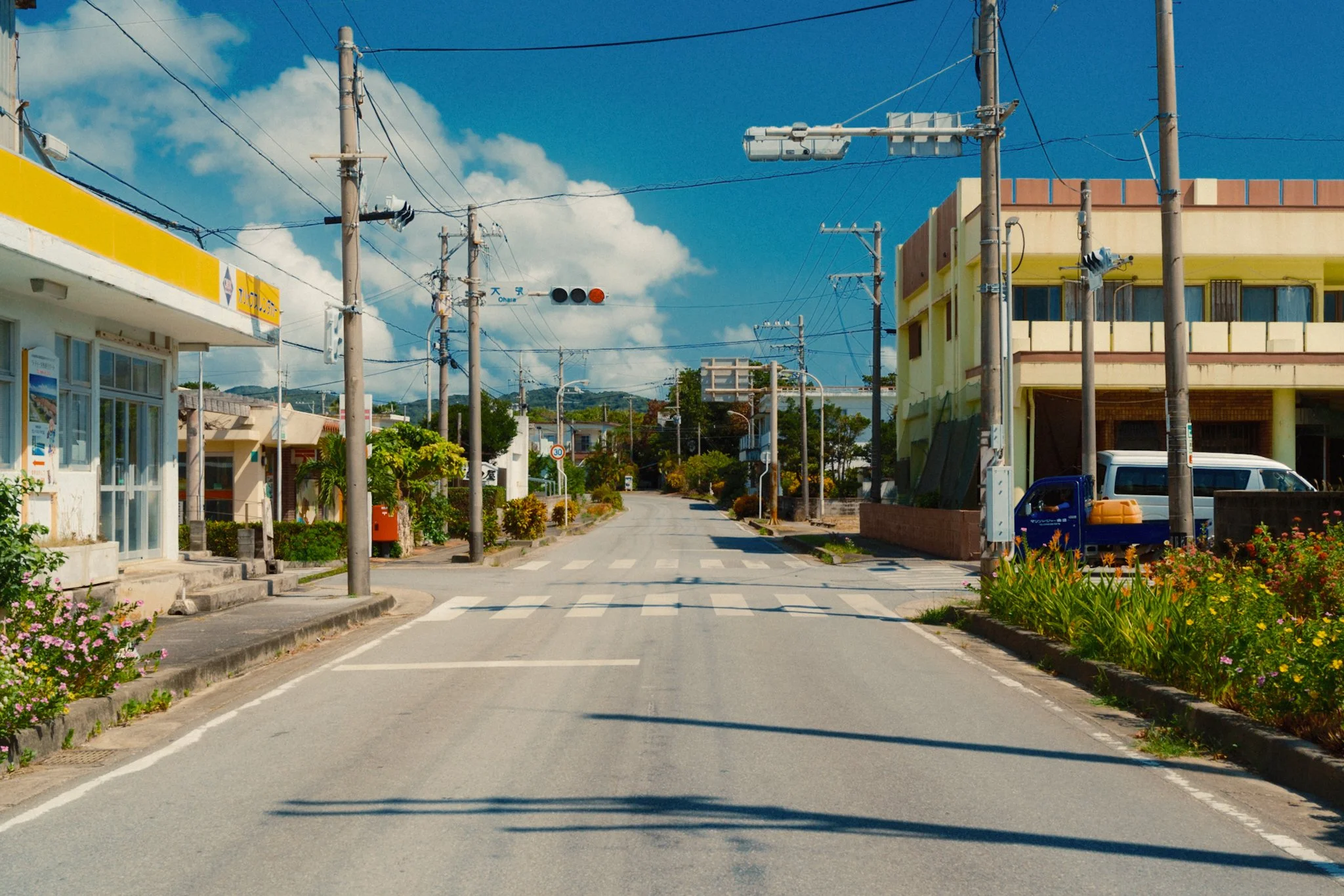
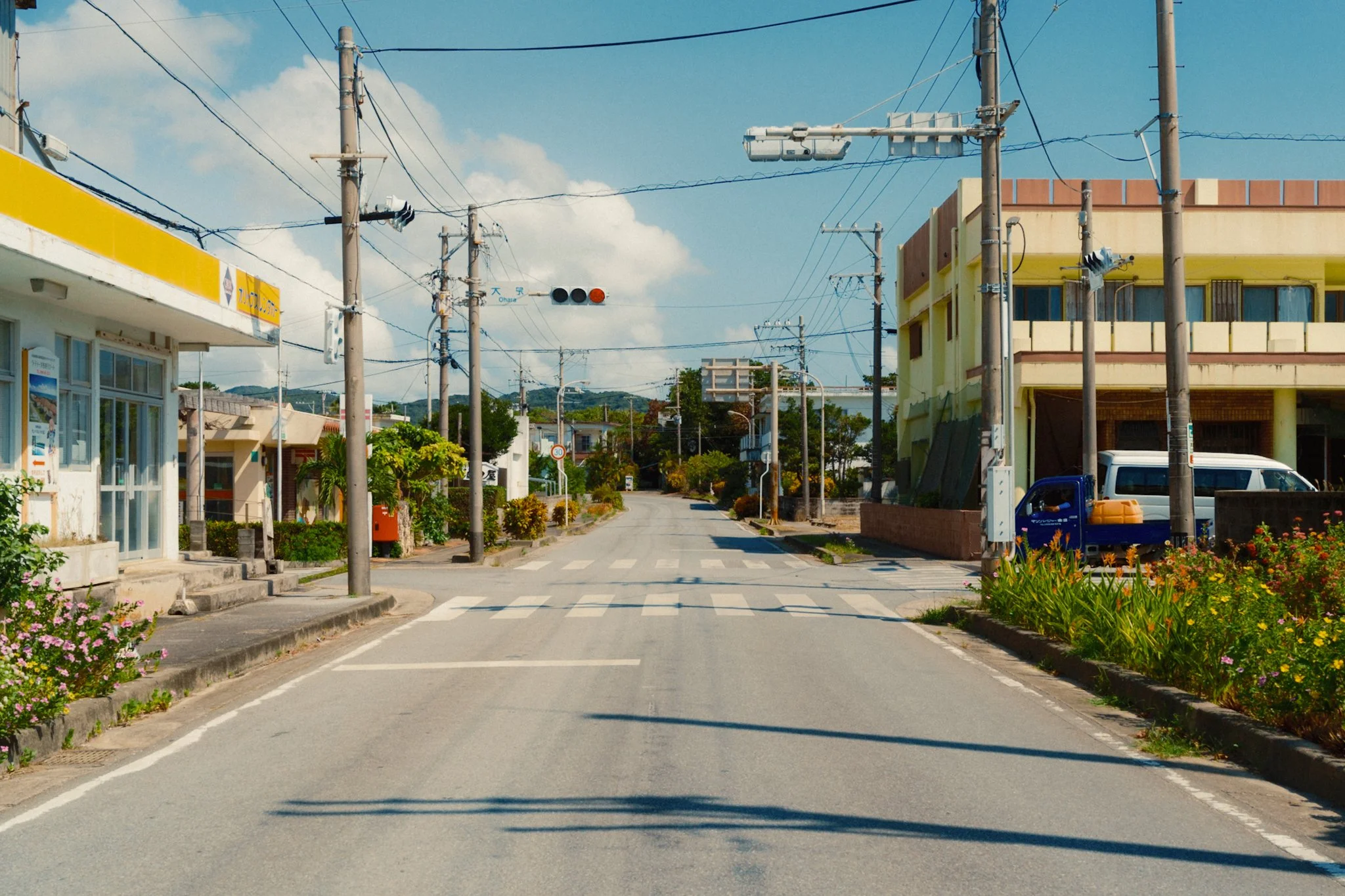
The image was cropped to bring more attention to the middle. The geometry adjustment helped to straighten the buildings for a more tidy look.
Fixing any geometrical issues can also go a long way to restoring a photo that feels a bit off. This is where you fix any vertical or horizontal lines that appear to be a little off. In Lightroom, the tool is called Geometry, and in Capture One, it’s Keystone. In most cases, the auto feature is enough; however, be very careful not to make the image look unnatural. Sometimes having everything straight just looks weird.

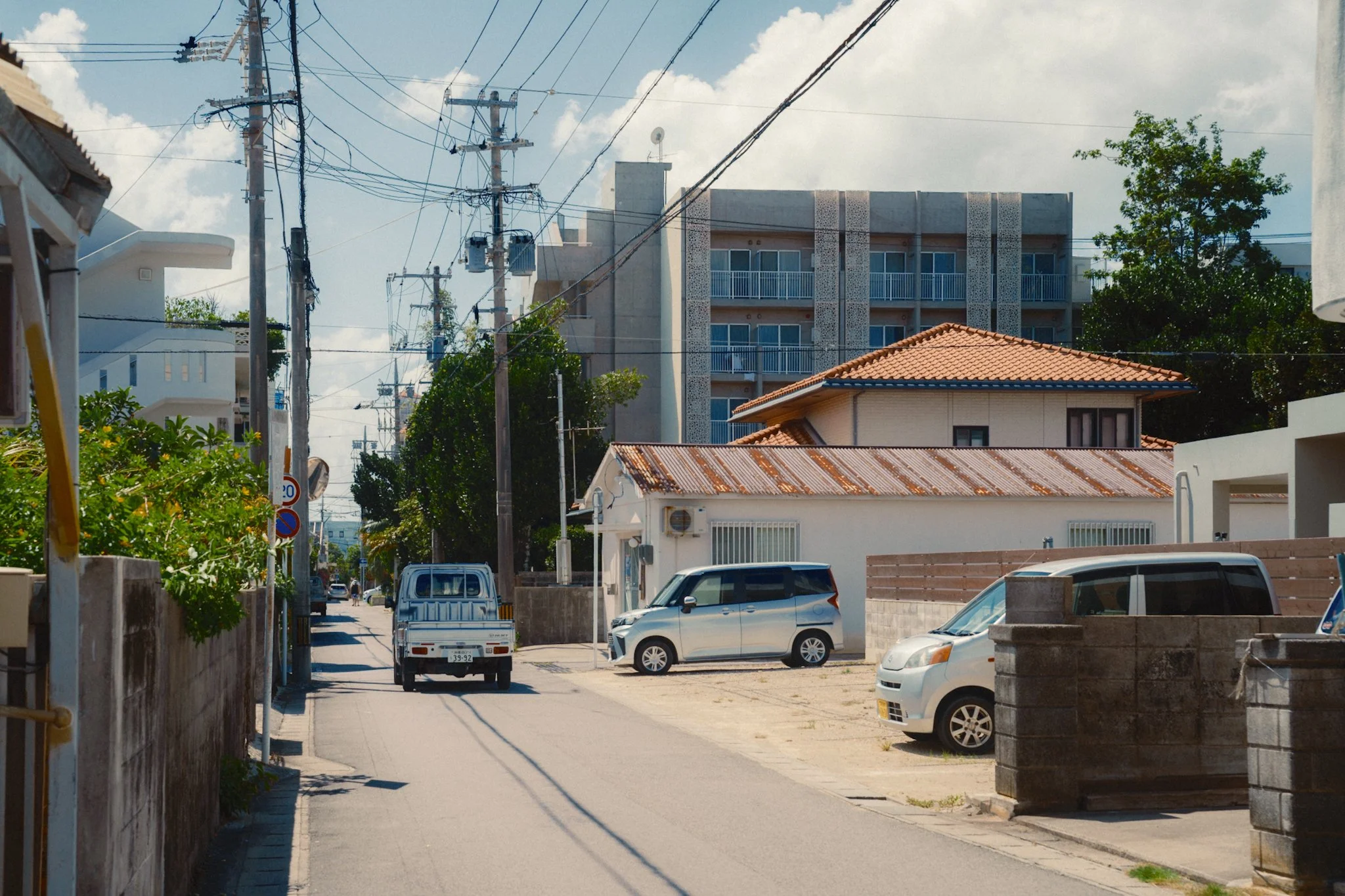
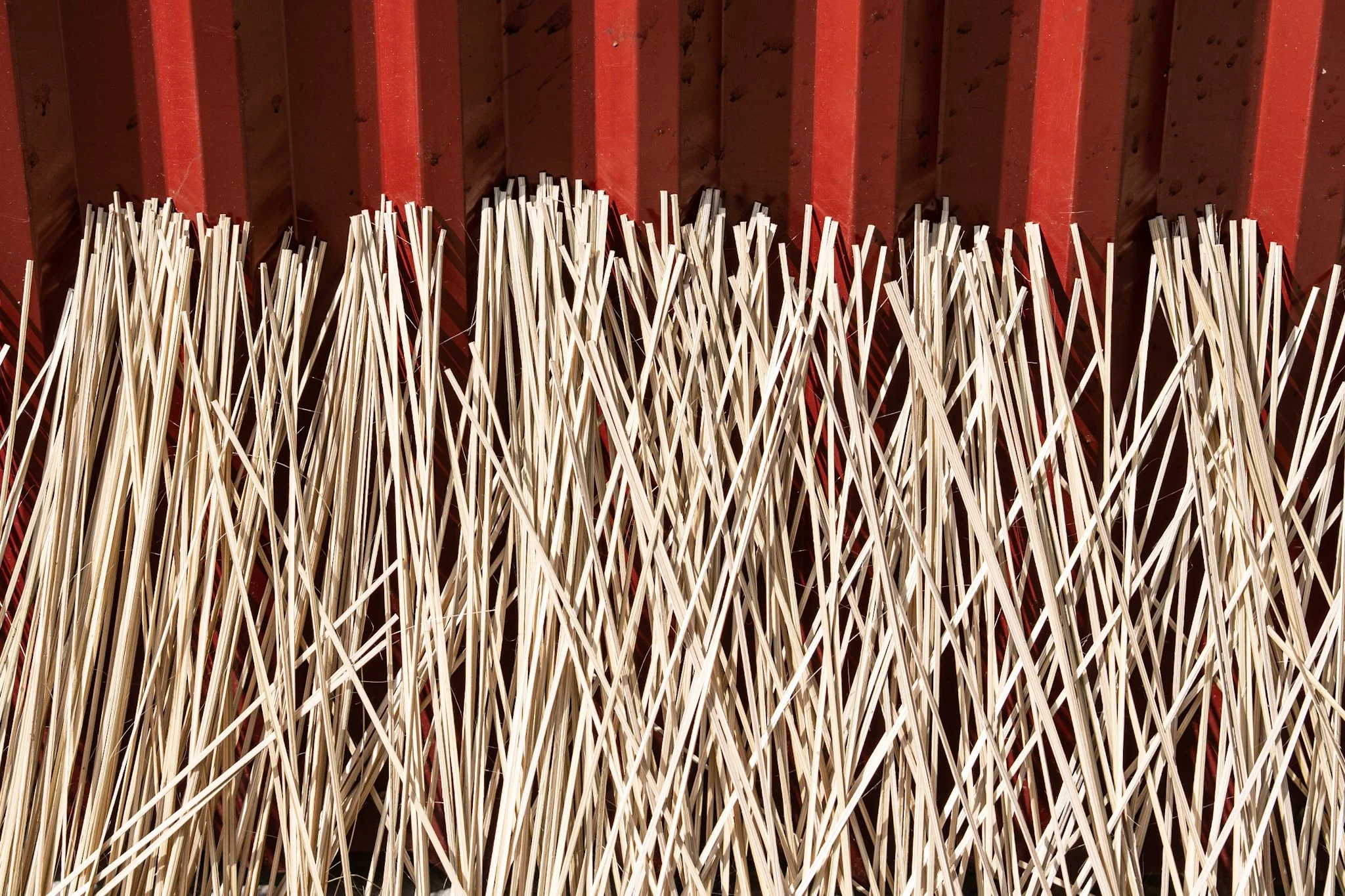
In this shot I managed to get the composition in camera, so I didn’t feel the need to crop. However, the image still feels a bit off.

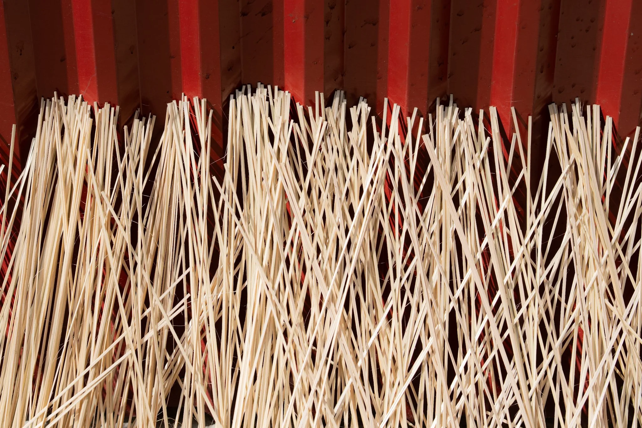
A geometry adjustment to straighten all the vertical and horizontal lines cleans up the image well. While the difference is small, it’s noticeable and can make a huge difference.
Exposure & White Balance
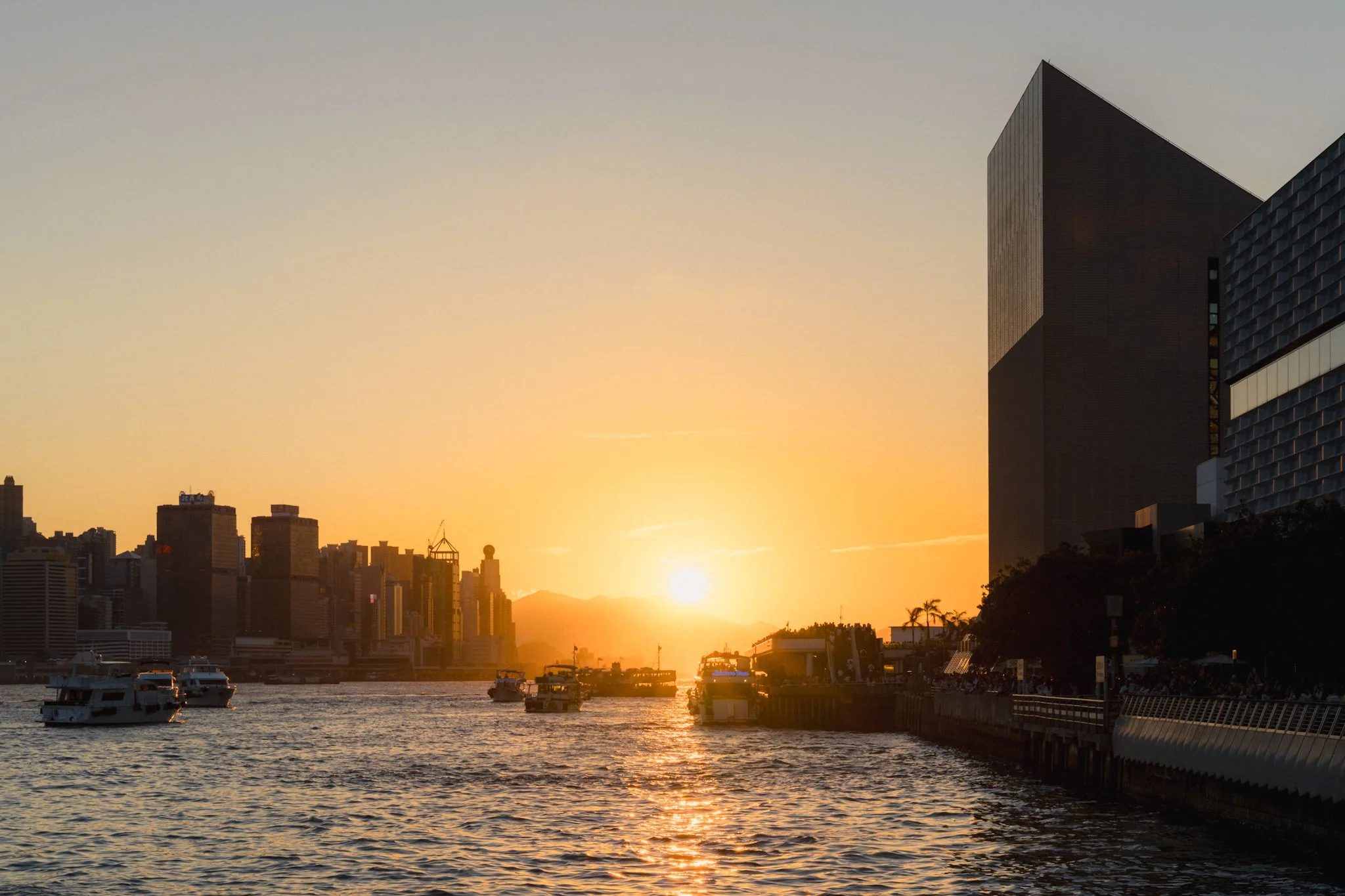
I can’t remember how many times I thought the image was trash, only to end up loving it once exposure and white balance are fixed. These two adjustments carry more weight than everything else combined when it comes to tone and colour. Often, cameras will mess up the exposure and white balance, and you will end up with an image that has zero resemblance to what you saw. A good example is shooting around water on a clear, sunny day. In many cases, images can end up too cold and dark, which can make even the most amazing photo look like trash. This blog goes into more detail.

While the camera exposed and white balanced this photo correctly from a technical standpoint, to me it looks dark and cold, which is not how the locations looked to my eyes.

If you look at graphs, this might seem too bright and warm, but to me it’s much closer to how it looked in real life. OF course this was only exposure and white balanced, and other adjustments need to be made to make this image work.
If you’re finding this blog helpful, and wish to learn everything I know about photography, please consider supporting by picking up my book below. Not only do you get 300+ pages of everything I know, but you also get free updates as I release new chapters. Finally this book helps keep this blog ad-free.
My Little Photography Book is everything I know about photography in one concise place. This book is designed to save you time and share years’ worth of knowledge in an easy-to-follow format. Think of this as a workshop and a course in one affordable 300-page package.
This book covers psychology, gear, lighting, composition, storytelling, style, and a lot more. In other words, I’ve emptied my photography brain into this PDF. As always, keep in mind that this is simply my approach to photography, and everything I share is from my own experience.
The book is a digital PDF download and comes in two flavours. Two page spread and single page. The spread might be better for landscape viewing and printing, while the single page is more suited for vertical scrolling on a phone or tablet. The total download will be just over 100mb with each PDF being around 50mb.
This book has been in the making since mid-2017 and is by far my most involved project to date. This is also entirely done by myself from scratch. All the writing, editing, formatting, everything… it’s all me with no external input. I really do hope you like it, and as always, I welcome any feedback.
Please note that due to the nature of digital products, refunds are generally not accepted. However, if you experience any issues, feel free to contact me and I’ll review your situation individually. You are welcome to use this product for personal or commercial projects, but you may not copy, distribute, or resell the files in their original or modified form.
Finally, being a digital product means free updates when new chapters become available. The last update was in February 2025 to V2.
Thank you so much for your support
Much Love
Rome
Incorrect Contrast
Contrast is often seen as a quick fix to recover a dull image; however, knowing when to use this tool can be the difference between something that works and something that always looks a bit odd. Typically, you will come across two types of scenes: low and high contrast. While sometimes turning a low contrast scene into a high contrast one (and vice versa) can work, I often find it only looks good on abstract-style photos. For normal shots, I would advise not to force a low contrast scene into a high contrast one (or the other way around). This blog on shooting in harsh light demonstrates this point perfectly.
This photo was taken on a harsh sunny day, however given the position of the sun, everything looked a little washed out and flat. If I increase the contrast, the image would fall apart due to an unnatural amount of shadow and a rough overall look. Low contrast is preferred for this type of photo.

In this image, the scene had a lot of natural contrast because I was shooting from a dark place into a brighter one. If i reduce the contrast, the photo will feel like a HDR from 2014 and would nog longer have the same visual impact
Fix The Colours
Having the colours feel a little off can easily ruin the image. Even if white balance has been fixed, sometimes a photo needs a little extra work. A good example is an overpowering blue sky that is all too common on clear, sunny days. The image might look great, but the strength of the sky draws your attention away from the point of interest. This is where I would suggest using the HSL tool and reducing the strength of the blue tones in the photo.
While the image works, the sky is a little strong.
Increasing the luminance of blue tones maintains a natural sky without it being over powering.
Visual Mess
A visual mess can come from two key areas. Too many colours and too much detail. I try to only stick to three primary colours in my photos. When you have too many different colours, the photo starts to become too noisy and distracting. You want colour to help showcase the image, not the other way around. If I find myself with too many conflicting colours, I can use the HSL tool to bring some common colours closer together, for example, pink and purple.
If you have too much detail, it might be worthwhile hiding or removing some of it. If it’s rubbish on the floor, perhaps cloning it out can clean things up. If it’s a bunch of stray reflections, then the crop tool can help re-compose the shot. If neither of these works, then you can use a local adjustment such as a gradient mask to locally reduce the exposure and draw attention away from the noisy area.

While the photo is good, there a few details which I feel are making it messy and distracting the view from the subject.

The changes have been small, but enough to make a significant difference.
Harsh Details
Sometimes you have a lot of harsh details in your shot. This could be due to your camera and lens, or the lighting. While this won’t solve your issues, it can help reduce the damage a little. Simply reduce your clarity to about -15 and add a tiny bit of grain. In my experience, it’s enough to take the edge off. Also, make sure you’re not sharpening areas that don’t need it by using the masking slider and setting it to a high value of around 80+.
This image appears harsh.
Reducing the clarity a touch softens the image while still maintaining the detail.
Blown Out Highlights
This won’t bring back blown-out highlights, but it can at least make them less ghastly to look at. If your image has any overexposed areas that can’t be recovered, simply fade the white using the curves tool and add a bit of warm tone to the highlights. That, coupled with the negative clarity and a bit of grain from the previous point, should make blown-out highlights a little more bearable.

This is the original version with the sky blown out.
A slight fade on the whites using the tone curve can fix that.