How To Properly Compose Your Photos
When we talk about photography composition, we often immediately think about leading lines, framing, rule of thirds, or other known tools at our disposal. While all those are important in their own right, I feel the best method for composition has to do with image balance. No amount of leading lines will fix an unbalanced image. Equally, even the best frame will not work if the image is tilting to one side. These tools will enhance an already well-composed image, not fix one that’s totally out of whack. In this blog, I will share with you the concept of balance in your photography.
As you read on, if you find this blog helpful and would like to learn more, please check out My Little Photography Book. This is a 300+ page book that contains everything I know about photography. Years of experience packed into a concise digital book with free lifetime updates. This also ensures the blog remains ad-free for you to enjoy.
My Little Photography Book is everything I know about photography in one concise place. This book is designed to save you time and share years’ worth of knowledge in an easy-to-follow format. Think of this as a workshop and a course in one affordable 300-page package.
This book covers psychology, gear, lighting, composition, storytelling, style, and a lot more. In other words, I’ve emptied my photography brain into this PDF. As always, keep in mind that this is simply my approach to photography, and everything I share is from my own experience.
The book is a digital PDF download and comes in two flavours. Two page spread and single page. The spread might be better for landscape viewing and printing, while the single page is more suited for vertical scrolling on a phone or tablet. The total download will be just over 100mb with each PDF being around 50mb.
This book has been in the making since mid-2017 and is by far my most involved project to date. This is also entirely done by myself from scratch. All the writing, editing, formatting, everything… it’s all me with no external input. I really do hope you like it, and as always, I welcome any feedback.
Please note that due to the nature of digital products, refunds are generally not accepted. However, if you experience any issues, feel free to contact me and I’ll review your situation individually. You are welcome to use this product for personal or commercial projects, but you may not copy, distribute, or resell the files in their original or modified form.
Finally, being a digital product means free updates when new chapters become available. The last update was in February 2025 to V2.
Thank you so much for your support
Much Love
Rome
Do you ever look at an image and think, “Why does it feel off?” You can’t quite put your finger on it, but it just doesn’t sit right. Other times, you will look at a photo of a cup of coffee on a table and it just works 100%. In most cases, this is due to balance. When you look at the scene in front of you, you will come across 5 key elements: colour, highlights, shadows, detail, and negative space. Each scene will have at least 3 out of the 5 elements present. Let’s look at them in more detail.
Colour
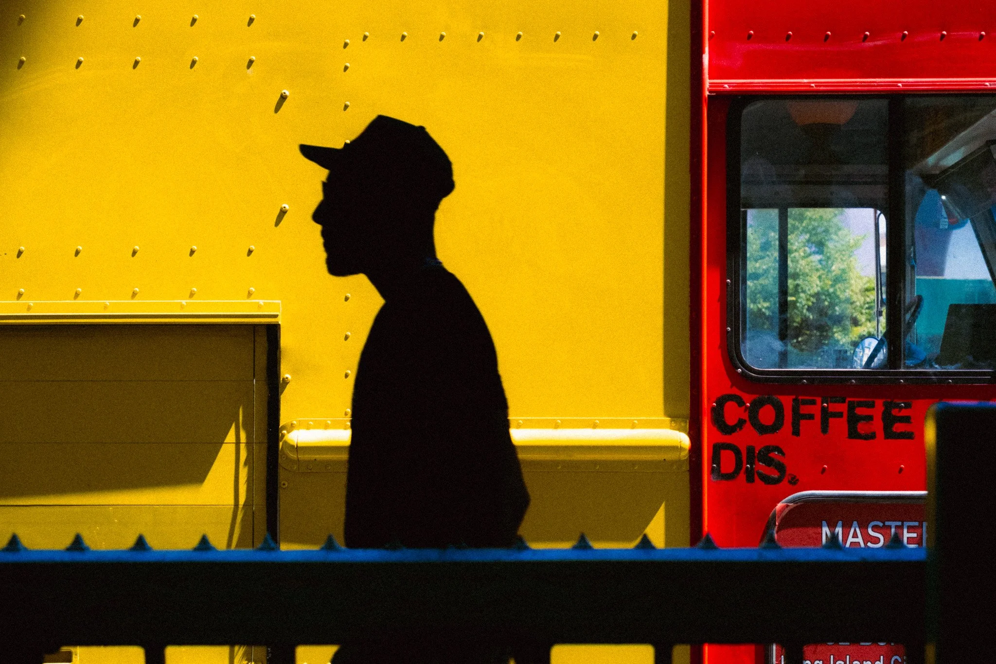
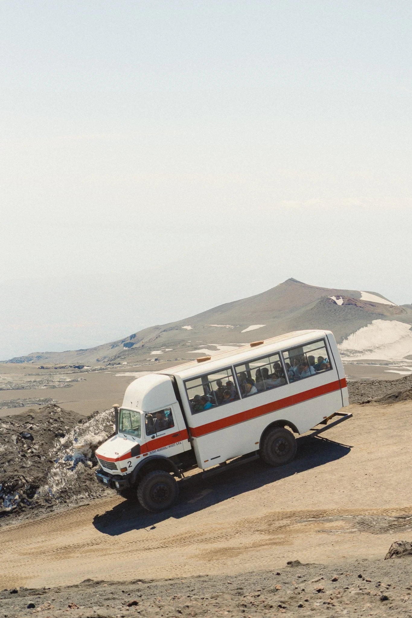
First of all, we have colour—specifically bright and vibrant colours that will catch your attention immediately when you look at a scene or an image. It could be a red door, a yellow structure, or a green bus.
Highlights
As the name suggests, these are the brightest areas of your image. This could be a sunny sky, a sun flare, snow, street lamps, or anything else that’s bright. If it’s bright and catches your attention, then it falls under this category.

Shadows
The total opposite of highlights, these are areas of the scene which are darker, gloomier, and generally don’t get your attention as quickly as the brighter parts.

Detail
These are parts of the image where there is a lot going on or have plenty of detail. If a part of the image feels a little busy, that can also fall under this category. Could be a crowd of people, a complicated background, buildings with extensive details, or anything with ample pattern.

Negative Space
Total opposite to detail, this is a part of the image which has nothing. It could be a completely washed-out sky, a shadow area that’s fallen to black, a clean wall, or any element that lacks detail.

Now that you understand the different elements, let’s discuss how much weight each one of them carries. When I say weight, I don’t mean in KG, I’m talking about visual weight. The quicker something takes your attention, the more visual weight it has.
Colour
Bright and vibrant colours will command the most weight, as they will take your attention almost immediately. All you need is a bit of bright colour within a dull scene to shift most of your focus on that specific part of the image.
Highlights
As with colour, highlights will always command your attention first, and your eyes will naturally gravitate towards the brighter elements in your frame. The brighter the element, the more weight and attention it will command. Compared to colour, I would say they can be about the same. However, if you have a bright element that is also vibrant, then that will command the most weight and attention.
Detail & Negative Space
I’ve batched these together because I feel they can equal out as long as both are of a similar scale, tone, and saturation. However, in some cases, one will be heavier than the other. These elements will hold less weight than highlights or colour. The busy areas will have you looking closely at the details, whereas the negative space will simply take more real estate within the frame and will have you looking around, trying to see if there is anything else going on.

Shadow
The shadow area of your image will get the least amount of attention and will fall to the back of the queue when it comes to the pecking order of the different elements. The main reason is that there is nothing within that area that is particularly eye-catching, so naturally, you will see it last.

Now that you understand each element in detail, the next step is to understand how the elements interact with each other and, most importantly, how you can combine them together to achieve a balanced image. A well-composed image is a balanced image. An image that doesn’t feel like it will tip over to the left or to the right. It also doesn’t feel top or bottom heavy. For every part, there’s an equal and opposing one to balance the composition out.
If you have a bright colour of a certain size, you will need a larger and darker area to balance it out.
If you have a bright sky, then you would need a larger shadow area to achieve balance.
If you have a large area of negative space, you would need an area in the image which has some detail in order to balance things out.
Just how you’d need a bigger plastic ball to balance with a smaller steel ball, you’d need a larger darker area to balance with a smaller brighter area.

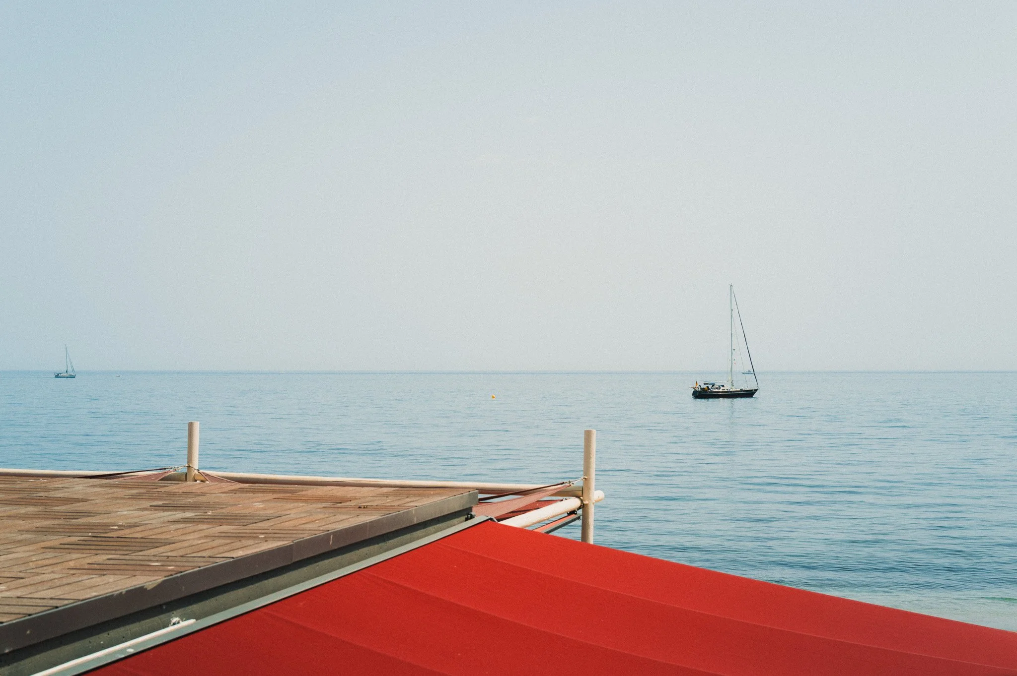
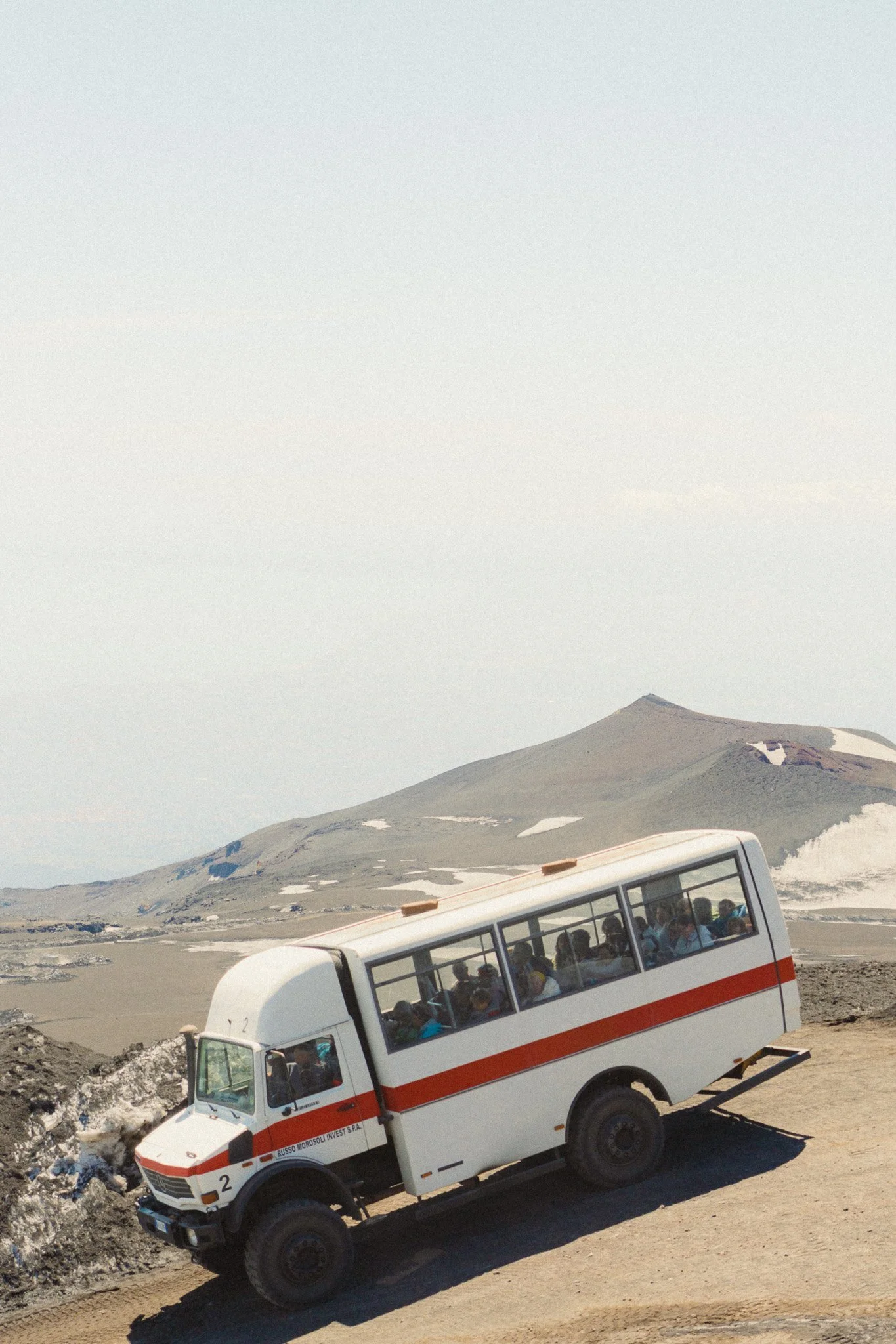
In this example the photo is balanced well. We have a small bright highlight area with some details that’s being offset by a larger and cleaner shadow area.

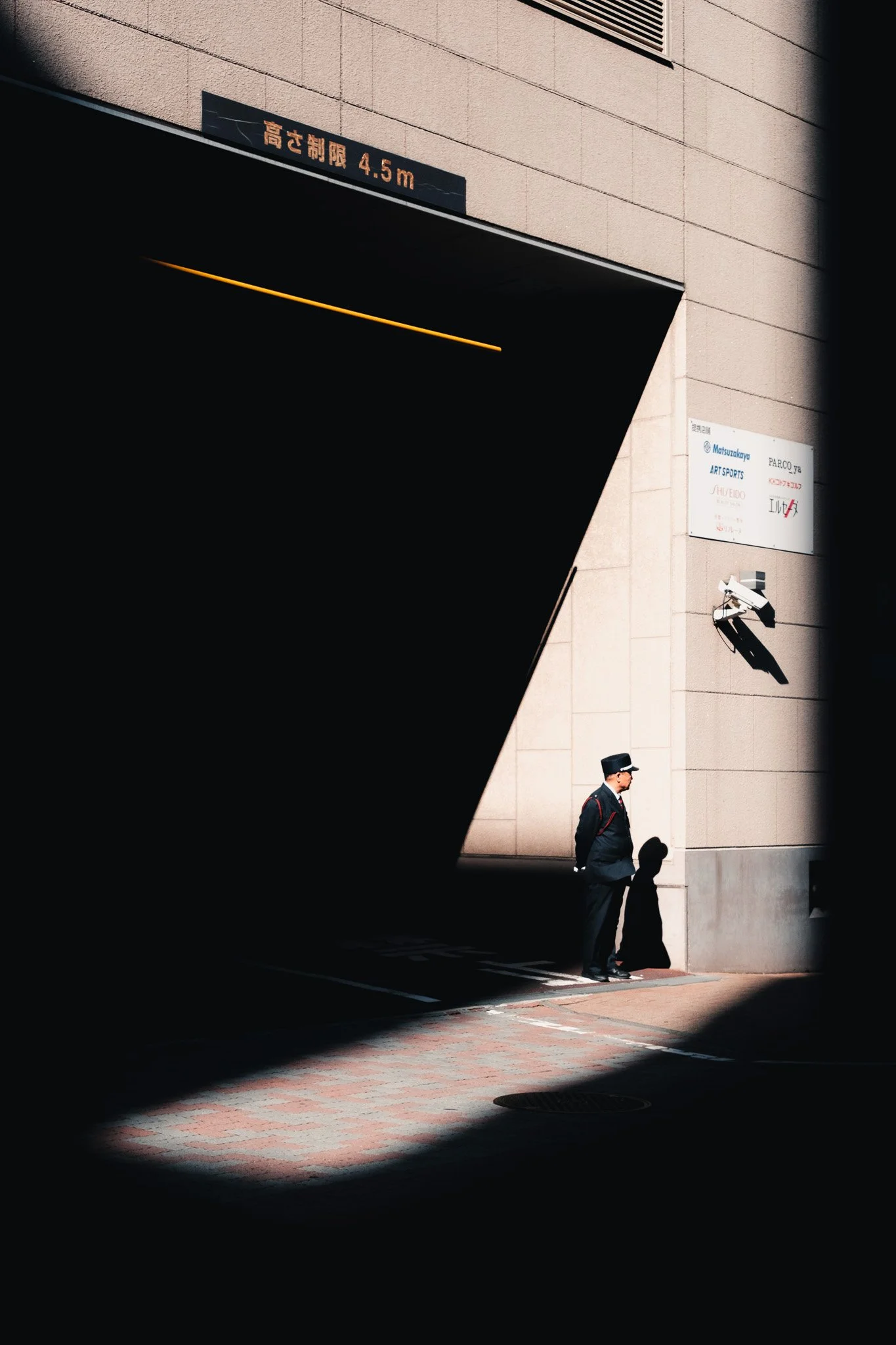
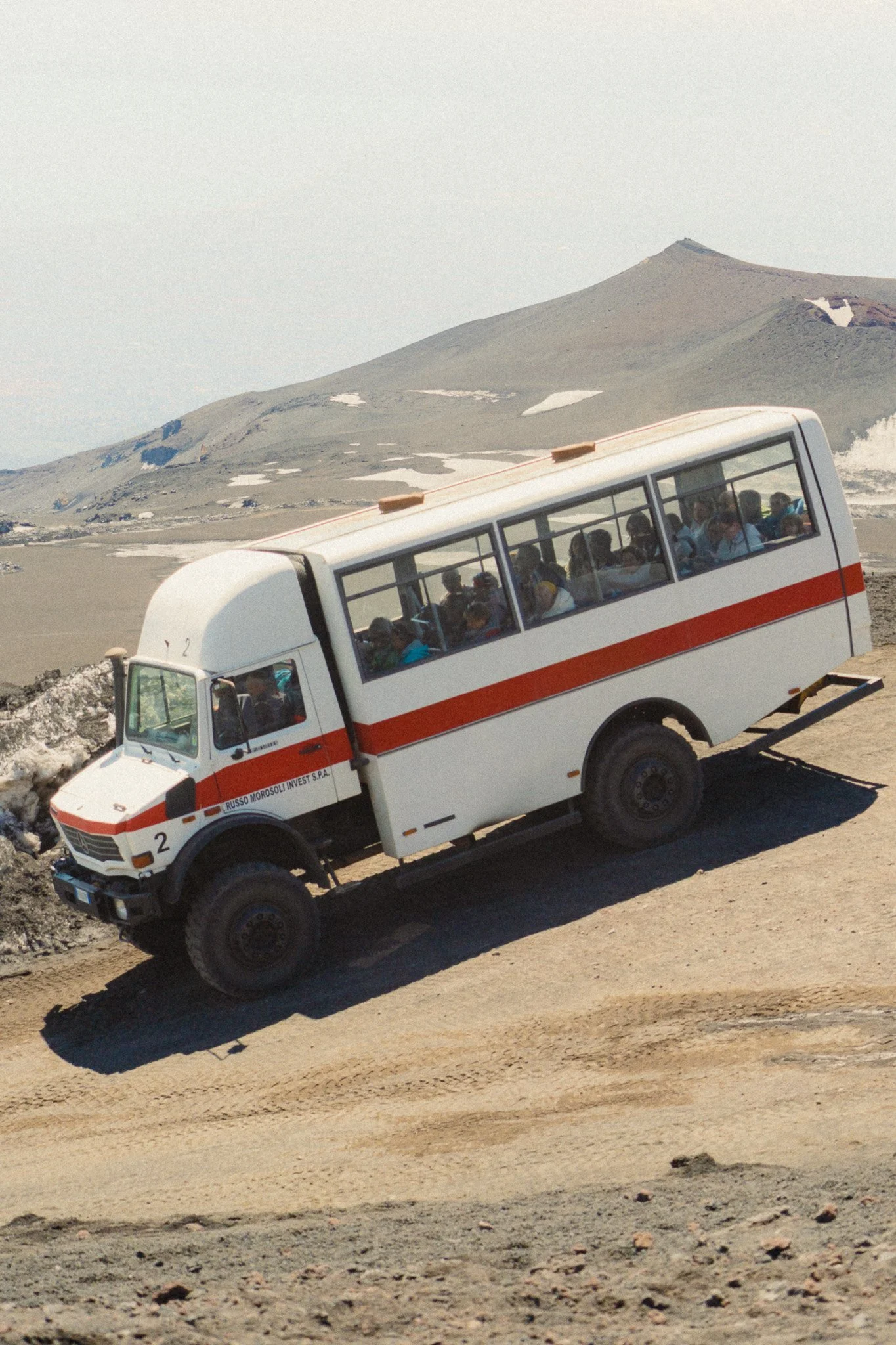
In this version the shadow area is too prominent and is taking all your attention. The image is not balanced and feels like it’s leaning to the left.

In this version the highlight area is too big and the shadow area is too small. This makes the image lean over to the right and no longer feel balanced.
This image is balanced well. The lower half has plenty of detail while the top half balances it out with clean negative space.
In this version there is too much negative space in the sky and not enough lower detail to balance it out. This image feels top heavy.
The opposite is true for this example. Not enough sky to balance out the intense details. This leaves the image feeling crowded and bottom heavy.
Although this is the primary way I go about composing my images, there are also 3 little things which I always keep in mind and try to find in every scene.
Leading Lines
I try to find leading lines that will take your eyes towards the subject or point of interest. They can be anything within the image that point the viewer towards where they should be looking.

Framing
Once you find a subject in the scene, try to use other elements within the environment to frame your subject so that the viewer has a clear box within which to look.

Foreground Element
The main purpose of a foreground element is to put the viewer in the photo and give context. Another way to describe this technique is to say “shooting through something”.